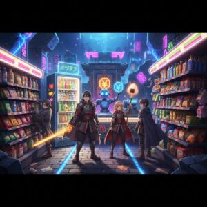
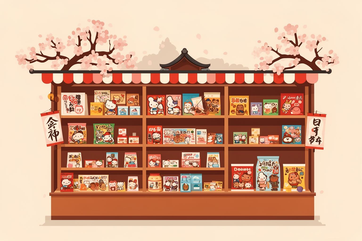
You know that feeling when you step into a place so dense with memory that it feels like time travel? In Japan, that place is often a dagashiya. It’s a tiny, cramped shop, usually tucked away on a quiet neighborhood street, overflowing with cheap snacks and sweets. The air is a strange, sweet mix of dried squid, ramune soda, and dusty cardboard. But the real sensory overload is visual. Your eyes dart between tubs of colorful gummies, plastic packets of rice crackers, and chocolate cigarettes, all vying for attention. It’s a chaotic, kaleidoscopic world, and the tickets to this world are the wrappers themselves—tiny, vibrant canvases of a bygone era.
These aren’t just packages; they’re artifacts. Specifically, they are artifacts of the Showa Period (1926-1989), particularly the high-growth decades after the war. This was a time of explosive change in Japan—of economic miracles, burgeoning consumerism, and a boundless, sometimes naive, optimism for the future. And nowhere is that spirit more purely preserved than on the packaging of a ten-yen bubblegum. These wrappers are a masterclass in a unique Japanese aesthetic: a collision of Western-inspired Pop Art and a homegrown, early version of kawaii, or cute culture. They tell a story not just about snacks, but about a nation finding its new identity, one brightly-colored, mass-produced treat at a time. To understand modern Japan, from its slick branding to its global cultural exports, you have to start here, in the glorious, noisy aisles of the neighborhood candy store.
The playful spirit of Japan is equally evident in contemporary pastimes as seen in the enduring allure of pachinko addiction, a phenomenon that mirrors the country’s nostalgic embrace of vibrant, transformative eras.
What Exactly is a Dagashiya? The Ten-Yen Temple of Childhood
Before exploring the art, it’s essential to understand the gallery. The dagashiya (駄菓子屋) is a unique type of establishment, fundamentally distinct from a modern convenience store or supermarket. The name itself reveals the story. Wagashi (和菓子) are the elegant, often costly, traditional Japanese sweets served at tea ceremonies—carefully made from rice flour, red bean paste, and seasonal ingredients. Dagashi (駄菓子), by contrast, roughly means “worthless” or “trivial” sweets. The “da” (駄) character suggests something cheap, common, and unrefined.
However, for generations of Japanese children, “trivial” meant accessible. These were snacks purchased with their own pocket money, a few carefully saved ten-yen coins held in a sweaty palm. A visit to the dagashiya after school was a daily ritual, representing a first taste of economic freedom and consumer choice. The shops themselves became extensions of the playground—a social hub where kids gathered, traded snacks, and lingered under the watchful eye of the shopkeeper, often an elderly woman serving as the neighborhood matriarch.
The golden era of the dagashiya was from the 1950s to the 1970s. Japan was rebuilding, families moved to cities, and a new middle class was emerging. Life improved, but frugality remained a virtue. Dagashiya thrived in this setting, offering affordable little luxuries that children could call their own. The shops were often part of the owner’s home, a small front room packed from floor to ceiling with glass jars, plastic bins, and cardboard boxes. There was no sleek marketing or minimalist design here. It was a treasure hunt, a visual jungle where every item fought for attention. This competitive atmosphere is exactly what made cheap candy packaging such a rich ground for bold and experimental design.
The Showa Visual Revolution on a Gumball Wrapper
To truly appreciate the aesthetic of Showa-era packaging, you need to imagine the world it emerged from. Post-war Japan was a society undergoing rapid change. American culture, once viewed as the enemy, had become a powerful and aspirational influence. Television was becoming a common fixture in households, airing everything from American sitcoms to homegrown superhero series like Ultraman and Kamen Rider. Manga magazines were selling like hotcakes, filled with vibrant action and expressive characters. This dynamic mass media created a shared visual language, which dagashi makers eagerly embraced.
Candy packaging transformed into a miniature billboard, a pocket-sized reflection of the era’s spirit. The aim wasn’t subtlety or elegance; it was immediate impact. A wrapper needed to catch a child’s attention from across a cluttered room and instantly convey: this is fun, this is modern, this is tasty, this is cool. Printing technology was often simple, limiting color choices and detail. Yet these constraints, as often happens in art, inspired a kind of creative ingenuity. Designers worked with flat color fields, bold outlines, and uncomplicated typography. The outcome was an aesthetic that, whether intentional or not, echoed the Pop Art movement rising in the West, but with a distinctly Japanese twist.
Pop Art, Japanese Style: Bold Lines and Brash Colors
When you think of Pop Art, Andy Warhol’s Campbell’s Soup Cans or Roy Lichtenstein’s comic book panels likely come to mind. The movement celebrated the ordinary, the mass-produced, and the commercial, drawing imagery from advertising and everyday life and elevating it to the level of high art. In Japan, this same impulse unfolded not in galleries but on the shelves of the dagashiya. The connection wasn’t a direct, academic one; rather, it was a parallel development driven by similar cultural forces of mass production and media saturation.
Explosive Typography
The lettering on Showa candy is a visual spectacle. There’s no subtle, minimalist font here. Product names burst forth in jagged, starburst-like shapes. The Japanese phonetic script, katakana, with its sharp, angular forms, was ideal for this purpose. It was often depicted in thick, chunky letters with heavy drop shadows, lending a three-dimensional effect. Words appear slanted, curved, and stretched to their extremes, imitating the sound effects—GAAAAN! DOKAN!—common in manga. English words were also scattered throughout, not necessarily for their meaning, but for their exotic, modern appeal. Words like “Juicy,” “New,” or “Lucky” added an international flair, reflecting Japan’s growing engagement with the wider world.
A Riot of Color
The color palette of Showa Pop is boldly vibrant. Imagine saturated primary and secondary colors: fire-engine red, canary yellow, electric blue, and bright orange, often placed directly next to one another. These were not harmonious, nature-inspired palettes but industrial, artificial hues that stood out under the shop’s fluorescent lighting. This boldness was a direct reflection of the era’s confidence. Japan was emerging as a leader in manufacturing cars, electronics, and plastics. The colors on these wrappers echoed the bright enamel of a new car or the glossy plastic of a new toy. They symbolized the color of progress.
Icons of a New Age
The imagery tapped directly into the imagination of a Showa-era child. Rockets, futuristic cars, and friendly robots promised a technologically advanced future. Baseball stars, sumo wrestlers, and popular movie monsters linked the snacks to the heroes and villains seen on TV and in the news. A prime example is the long-running “Menko” candy, which included a small cardboard disc featuring a popular character. The candy was secondary; the real prize was the collectible disc showcasing Ultraman or a famous baseball player. The packaging itself became part of the play experience, opening a gateway to a broader world of stories and games.
The Birth of Cute: Finding Proto-Kawaii in Chocolate Coins
Running alongside the loud, brash Pop Art style was another, gentler visual language that would eventually evolve into a global cultural phenomenon: kawaii. The polished, commercially perfected cuteness of Hello Kitty or Pokémon traces its origins back to simple, charming illustrations found on Showa-era candy.
This early incarnation, which might be called “proto-kawaii,” differs from its modern counterparts. It is less polished, more innocent, and often carries a subtly melancholic or wistful tone. This aesthetic primarily emerged from shōjo manga (comics for girls) and the work of illustrators such as Rune Naito, Macoto Takahashi, and Ado Mizumori. Their magazine, stationery, and merchandise illustrations in the 1950s and 60s set a new standard for girlish charm.
The Anatomy of Early Kawaii
The fundamental elements of this style are instantly recognizable. Characters, whether human or animal, feature disproportionately large heads and small bodies. Their most striking feature is their huge, expressive eyes, often depicted with a starry sparkle or a few delicate lashes to express innocence and emotion. This visual motif naturally became a hallmark of anime and manga. The shapes are simple and rounded, with soft lines and an absence of sharp angles. Poses tend to be slightly awkward or shy, intended to inspire a protective feeling in the viewer.
A Softer Palette
While Pop Art designs shouted in primary colors, proto-kawaii spoke softly in pastels. Packaging for sweets aimed at girls often showcased soft pinks, baby blues, mint greens, and lemon yellows. These hues created a dreamy, gentle atmosphere, far removed from the action-packed designs featuring robots and superheroes. Consider the classic Botan Rice Candy box with its simple, charming floral artwork, or Morinaga’s Hi-Chew, long decorated with friendly anthropomorphized fruits on its wrapper. These designs focused not on excitement but on sweetness, tenderness, and a kind of innocent camaraderie.
This clear gender divide in design—bold and action-driven for boys, soft and cute for girls—offers a revealing glimpse into Showa-period social norms. The packaging wasn’t just promoting a snack; it was reinforcing a cultural narrative about how boys and girls were expected to view the world and their roles within it.
Why This Aesthetic? The Psychology of the Dagashiya Shelf
These dual aesthetics of Pop Art and proto-kawaii did not arise in isolation. They provided an ideal solution to a distinct set of commercial and cultural challenges. The intense competition on the dagashiya shelves required designs that were immediately understandable and emotionally engaging for a young audience. Designers, constrained by limited budgets and printing technologies, created a visual shorthand that was both cost-effective and remarkably impactful.
They tapped into the fundamental desires of childhood. For a few yen, a child could buy into the fantasy of space exploration, the excitement of a baseball game, or the comfort of a cute, friendly animal companion. The wrapper represented a promise, and the candy was the momentary fulfillment. It was a clever piece of marketing psychology, played out on a miniature scale.
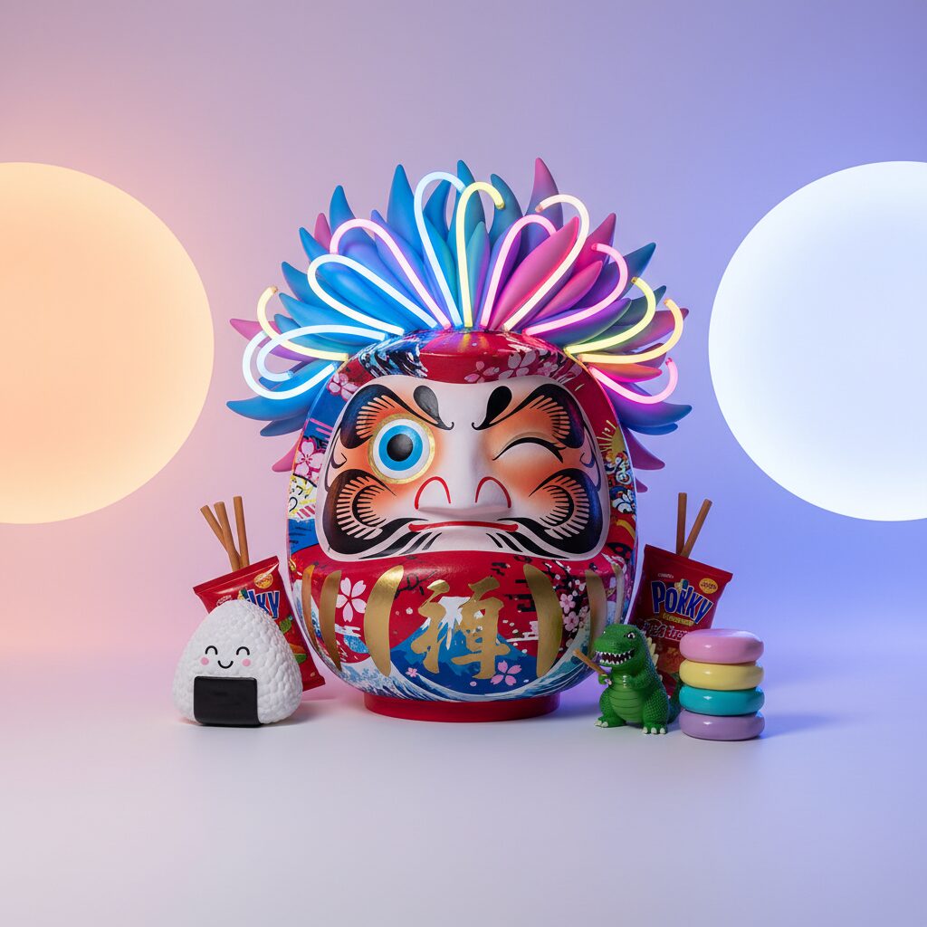
Today, these designs resonate for an entirely different reason: nostalgia. For Japanese people who grew up during the Showa era, these wrappers serve as powerful triggers for natsukashii, a Japanese word that conveys more than mere nostalgia. It signifies a bittersweet, fond yearning for a past that can never be recaptured. Spotting a familiar Fue Ramune (a candy that doubles as a whistle) or a packet of crunchy Baby Star Ramen can instantly transport someone back to the sensation of being seven years old on a hot summer afternoon. For foreigners, the attraction is different. It offers a glimpse into a Japan that feels more raw, more analog, and more idiosyncratically creative than the polished, minimalist image the country often presents today. It stands as a visual record of a nation dreaming out loud.
The Legacy of a Throwaway Artform
The humble dagashiya is a disappearing institution. The children who once made up its primary customers are now adults, and their own kids are more likely to buy snacks from shining, 24-hour convenience stores. Many of the old neighborhood shops have closed as their owners retired without successors. Yet, the aesthetic they nurtured has shown remarkable resilience.
The connection from the proto-kawaii of Showa-era candy to the global empire of Sanrio and the artistic Superflat movement, pioneered by Takashi Murakami, is unmistakable and direct. Murakami, especially, built his career by exploring and amplifying these very aesthetics, merging the polished production of modern anime with the raw commercial spirit of its post-war predecessors. The DNA of those early, wide-eyed characters is now woven into everything from high fashion to contemporary art.
What started as a disposable, fleeting art form has now turned collectible. Enthusiasts seek rare and mint-condition wrappers, treating them with the same reverence as rare stamps or coins. They are stored in binders and showcased online, tiny monuments to a specific moment in design history. The candy itself might have been eaten in seconds, but its packaging has attained a strange kind of immortality.
These wrappers prove that great design isn’t always found in museums or costly art books. Sometimes, it appears in the most mundane places. They remind us that culture is not only what we deliberately preserve but also what endures by chance—the everyday things that go unnoticed until they almost disappear. In their chaotic, colorful, and utterly charming way, they capture the spirit of a hopeful, energetic, and endlessly creative era in Japan’s history. They are the sweet, lingering flavor of yesterday.