Yo, what’s up? Ever been deep in a YouTube rabbit hole or flipping through vinyls and stumbled upon it? That look. That unmistakable vibe from old Japanese album covers. You know the one. A sky so blue it hurts. Palm trees slicing into a pastel sunset. A lone convertible cruising down an empty coastal highway. Maybe a shimmering, impossibly clean swimming pool next to a sleek, modernist house. It’s a whole mood. A ticket to a place that feels like a sun-drenched memory you never actually had. This was the visual calling card of Japan’s “New Music” in the 1970s, which would eventually morph into the global phenomenon we now call City Pop. And seeing it, you might think, “Damn, was 1970s Japan just one big beach party?” The short answer? Not even close. The reality was a world away from these perfect, breezy vistas. So the real question, the one that gets to the heart of something truly Japanese, is why. Why did a nation, in the thick of a gritty, smog-choked, work-obsessed industrial boom, collectively start dreaming of an island paradise that, for most people, simply didn’t exist? This wasn’t just about selling records. It was about packaging an escape. It was about manufacturing a feeling—a deep, societal yearning for space, leisure, and a touch of American-style cool. This art wasn’t documenting a reality; it was projecting a national aspiration onto a 12-inch cardboard sleeve. It was a beautifully designed lie that told a deeper truth about the hopes and anxieties of a generation. Before we dive into the deep end, let’s ground ourselves in a place that served as the real-world, albeit less glamorous, stand-in for this fantasy: the Shonan coast, a stretch of beach just a short drive from the concrete jungle of Tokyo.
This visual escape from the industrial grind was part of a broader cultural response to the era’s pressures, much like the way the Showa salaryman’s lifestyle became a defining soundscape of modern Japan.
The Vibe Check: What Exactly IS This “Island Aesthetic”?
Before we dive into the why, we need to first align on the what. This aesthetic goes far beyond just some attractive visuals. It’s an entire visual universe with its own rules, unique color palette, and a recurring cast of non-characters. It’s a carefully crafted fantasy, with every detail serving a purpose. Calling it simply “album art” is like referring to a meticulously made cocktail as just “a drink.” No way, fam. It’s an experience. It’s a portal to another world. When you look at one of these covers, you can almost feel the warm breeze, hear the distant waves, and taste a salty cocktail. The music itself—a smooth, refined fusion of American-inspired soft rock, soul, funk, and jazz—is the soundtrack, but the artwork is the gateway. Together, they form two halves of the same flawless, escapist whole. Let’s dissect the visual DNA of this dreamscape, because once you recognize the patterns, you’ll see them everywhere and appreciate just how intentional this creation truly was.
The Visual Language of Escape
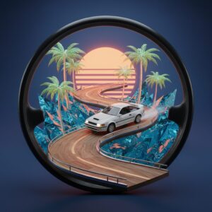
The central motifs serve as a visual checklist for crafting the ultimate fantasy getaway. First and foremost, the star of the show: the sky. It’s never a plain blue canvas. Instead, it’s an otherworldly, hyper-real shade of azure, a gradient blending twilight orange and pink, or a vast, cloudless expanse implying limitless possibility. This starkly contrasts with the often gray, polluted skies of 1970s Tokyo or Osaka. On these albums, the air is always pristine. Then there’s the architecture and landscape: sleek, modernist buildings with oversized glass windows, minimalist balconies, and of course, the ever-present swimming pool. The pool water is always calm, shimmering turquoise, perfectly still and mirroring the flawless sky above. It symbolizes private, luxurious leisure. Palm trees abound, their sharp, graphic silhouettes striking against the sky. Though palms don’t line every street in Japan, they serve as a universal emblem of “exotic paradise,” a visual shorthand for “you’re no longer confined to your cramped apartment.” Next come the cars—always stylish, frequently American convertibles or sleek sports coupes. They embody freedom, mobility, and laid-back wealth. Often parked under the sun or shown cruising a winding coastal road toward the horizon, they emphasize that the journey matters as much as the destination. What’s most intriguing, however, is what’s often absent: people. If present, they remain anonymous. You might spot the silhouette of a woman by a pool or a distant couple. Their faces are rarely revealed. This is a brilliant tactic. It depersonalizes the scene, turning it into a blank slate. It’s not their vacation; it’s your fantasy vacation. You, the listener, are invited to step into that driver’s seat, lounge on that pool chair. You are the protagonist of this sun-soaked tale.
More Than Just a Picture, It’s a Mood Board
This aesthetic wasn’t accidental; it was a brand identity for a new generation. The music of artists like Tatsuro Yamashita, Eiichi Ohtaki, and Haruomi Hosono marked a shift from the folk protests and pop ballads of the ’60s. It was smoother, more intricate, and sonically ambitious. It was music made for adults with refined tastes, for those owning stereo systems capable of doing justice to lush production. The album art had to mirror that sophistication. It needed to convey that what lay inside was premium, modern, and cool. The entire package—the sound, lyrics about summer romance and city life, and the cover art—worked together to sell not just music but a lifestyle. An akogare, a Japanese word meaning more than “aspiration”; it’s a profound, wistful yearning for something beautiful yet perhaps just out of reach. Color played a pivotal role in setting this mood. Artists like Hiroshi Nagai and Eizin Suzuki, masters of color theory, employed vibrant pastels, electric blues, and glowing sunset shades to craft a world sharper and more perfect than reality. It was an elevated reality, like a memory polished to brilliance. This is essential to grasping the phenomenon. The aim was never realism. It was to evoke an idealized nostalgia for the present moment. To take the era’s newfound affluence and leisure and distill it into the most flawless, visually delightful form. When you bought an album like Eiichi Ohtaki’s classic “A Long Vacation,” you weren’t just purchasing songs. You were securing 40 minutes of entry to that perfect, endless summer captured on its iconic cover.
The “Why” Behind the Vibe: Japan in the Roaring ’70s
So, we’ve clarified the what: a flawless, sun-drenched, American-infused fantasy world. Now, the multi-million yen question: why did this particular dream resonate so profoundly with the Japanese public at this exact moment? To understand it, you need to zoom out from the album cover and examine the broader context of Japan in the 1970s. The country was in a strange, transitional phase. The remnants of World War II were fading memories, and the “Japanese Economic Miracle” was in full swing. Yet, this miracle came with a gritty, tiring reality. The idyllic island paradise depicted on the record sleeves was the perfect escape from the daily grind of the average Japanese city resident. It was pure, unfiltered escapism, born from a unique set of social and economic pressures. A dream fueled by new wealth, emerging technologies, and a deep-rooted desire to finally, finally relax.
Economic Boom Times, but at What Cost?
Let’s be honest: the 1970s in Japan were demanding. The nation had successfully rebuilt itself into an economic powerhouse, a global leader in manufacturing, electronics, and automobiles. This brought jobs, rising incomes, and a growing middle class that, for the first time, enjoyed disposable income. People could afford color TVs, air conditioners, and importantly, cars and stereos. This newfound consumer power was the foundation of the New Music scene. But prosperity exacted a steep toll. Cities, particularly Tokyo and Osaka, had turned into sprawling concrete jungles. The architecture tended to be functional and brutalist, prioritizing efficiency over beauty. Work culture was intense. The era of the “salaryman,” the corporate warrior devoted to his company, was at its peak. The trade-off for economic security involved long hours, cramped commuter trains, and immense social pressure. Furthermore, rapid, unchecked industrialization created severe environmental problems known as kougai (public nuisance/pollution). Air pollution was so severe in major cities that schools sometimes canceled outdoor activities. The sky wasn’t the dreamy blue of a Hiroshi Nagai painting; it was more often a hazy, grayish blur. So, a vast population was working hard, living in tight urban quarters, breathing questionable air—but with some money in their pockets and a yearning for something more. What do you offer them? You sell them an escape. A 33 RPM gateway to a clean, spacious, beautiful world where the biggest concern is what drink to enjoy by the pool.
The Birth of a New “憧れ” (Akogare – Aspiration/Yearning)
This is where the idea of akogare becomes crucial. The island aesthetic was more than just a fun beach getaway. It tapped into a deeper cultural current. It symbolized a new set of aspirations for modern Japanese people. The old dreams centered on stability—a steady job, a family, a modest home. The new dream, made possible by the economic boom, focused on lifestyle. It emphasized sophistication, leisure, and a sense of personal freedom often at odds with Japan’s collectivist, duty-bound society. The album art became the mood board for this new dream. It depicted a life where you had the time and money to simply… be. To drive, relax, and savor a sunset without worrying about catching the last train home. This fantasy held power. International travel was becoming more accessible, yet trips to Hawaii or California remained major, once-in-a-lifetime events for most people. These records, however, offered that dream at the cost of a vinyl LP. You could take the fantasy home, put on the record, close your eyes, and be transported to that coastal highway or quiet poolside. It was a form of self-care, a mental vacation from real-world pressures. The art served as the visual anchor for this escape, making the fantasy feel tangible, even real.
The American Dream, Remixed for Japan
The profound influence of American culture on this aesthetic is undeniable. It’s built right in. The music’s sound was heavily inspired by American West Coast artists like The Beach Boys, Steely Dan, and the entire AOR (Adult-Oriented Rock) scene. The visuals were similarly influenced. Wide-open spaces, car culture, and sun-drenched living—this was the California dream, adapted and reimagined for a Japanese audience. Palm trees, convertibles, English song titles and lyrics were all designed to evoke an exotic, carefree cool. However, it’s a mistake to see this as a mere copy-and-paste. Japanese artists and designers took these American elements and filtered them through a distinct Japanese sensibility. The result is something unique. The Japanese version of paradise is cleaner, more orderly, and perfectly composed. Compare a David Hockney pool painting, an acknowledged influence on Hiroshi Nagai. Hockney’s works have a human texture and a certain messiness. Nagai’s pools, by contrast, are immaculate, almost sterile in their perfection, with not a ripple out of place. There’s also a subtle undertone of melancholy in both the music and art, a quintessentially Japanese sense of mono no aware—a gentle sorrow for the fleeting nature of beauty. Even at its most upbeat, there’s a sense that this perfect summer day is brief. It’s a captured moment of perfection, made all the more beautiful because it won’t last. It’s the American Dream, but remixed with a quieter, more introspective, and aesthetically disciplined Japanese spirit.
The Rise of the Car and the Weekend Getaway
The rise of the personal automobile in Japan during the 1970s was transformative, central to this entire vibe. For the first time, suburban Tokyo families had the freedom to simply get up and go. The car symbolized liberation from the rigid schedules of trains. It unlocked new leisure possibilities. The most popular destination for new car owners in Tokyo? The coast. Areas like the Shonan coast (with beaches such as Enoshima and Kamakura) and the Izu Peninsula became favored weekend retreats. They were close enough for day trips or weekend stays, offering a breath of sea air and open space deeply desired. This everyday experience laid the fertile groundwork for the New Music fantasy. Album art frequently references this newfound car culture: cars on winding coastal roads, scenic overlooks, parked outside beachside diners. The music itself is often called “driving music.” Many City Pop tracks have rhythms and tempos perfectly suited to cruising highway windows-down. This link to a real, tangible activity—the weekend drive—is what made the larger fantasy feel attainable. The album cover wasn’t just a dream of Hawaii; it was an idealized version of a place you could actually visit on Saturday. It transformed a familiar experience into myth, making the listener the protagonist of their own stylish road trip film.
The Artists Behind the Canvas: Architects of the Fantasy
This entire visual world did not emerge suddenly; it was shaped by a select group of visionary artists and illustrators who, alongside the musicians themselves, defined the aesthetic and atmosphere of an era. Their style became so impactful that separating the music from their imagery is nearly impossible. They were more than just designers-for-hire; they were creators of worlds. They transformed the collective desires of a generation into tangible forms, color schemes, and identities. Two artists stand as the foundational pillars of the City Pop aesthetic: Hiroshi Nagai, the master of serene, minimalist landscapes, and Eizin Suzuki, the advocate of vibrant, pop-art Americana. Though their styles differed, their aim was the same: to offer a glimpse into a better, cooler, more beautiful world.
Hiroshi Nagai: The Master of Pools and Palm Trees
If you picture one image from this genre, it is probably a Hiroshi Nagai painting. His work represents the gold standard, the quintessential example of the City Pop visual style. His most celebrated creation is the cover for Eiichi Ohtaki’s 1981 album “A Long Vacation,” a record so iconic that its cover is arguably the single most emblematic image of the entire movement. The painting is pure Nagai: a crystal-clear swimming pool in the foreground, a minimalist white building, a few sharp-leafed plants, and a row of palm trees set against a deep blue, cloudless sky. No people, no movement—just a profound sense of stillness and sun-baked tranquility. Nagai’s style is characterized by clean lines, flat color planes, and a masterful use of light. He is captivated by capturing the unique quality of American light, especially the bright, shadow-casting sun of California, experienced during his trips to the US. He paints the midday glare, the extended shadows of late afternoon, and the magical glow of twilight with extraordinary precision. His landscapes feel simultaneously real and surreal. They are “non-places,” devoid of specific cultural markers, allowing for universal appeal. His work draws heavily on American pop art and surrealism, with clear influences from artists like David Hockney and Salvador Dalí, but his execution is distinctively Japanese in its meticulous perfectionism. There is a zen-like calm in his compositions. Every detail is impeccably arranged. This obsessive order grants his fantasy worlds a soothing, aspirational quality. In a chaotic and cluttered Japan, Nagai’s art presented a vision of clean, refined simplicity. He provided a mental escape, a visual mantra of sun, sky, and serene water.
Eizin Suzuki: The Pulse of the Seaside Drive
If Hiroshi Nagai’s world embodies tranquil existence, Eizin Suzuki’s represents exhilarating action. While Nagai’s art is often still and contemplative, Suzuki’s bursts with motion, energy, and playful storytelling. He is the poet of the road trip. His most recognizable works were made for Tatsuro Yamashita, another titan of the genre. The cover of Yamashita’s 1982 album “For You” perfectly exemplifies Suzuki’s style. A classic blue convertible is parked on a pier, a woman’s leg clad in a red high-heel dangles from the passenger side, and a seaplane floats in the background. It’s a snapshot inviting you to imagine the story: Who are these people? Where are they headed? Suzuki’s art is rich with such narrative touches: open-air diners, retro American gas stations, jukeboxes, and stylish couples. His main influence was American pop art, especially the bold, comic-book-inspired style of artists like Roy Lichtenstein. He employs thick black outlines, vivid saturated colors, and slightly flattened perspectives that lend a graphic, animated feel. Above all, he celebrated Americana. His paintings are love letters to a dreamy version of 1950s and ‘60s America—the cars, fashion, and architecture. For Japanese audiences in the ‘70s and ‘80s, this symbolized ultimate cool. Suzuki’s work captured the freedom and optimism embodied by musicians like Tatsuro Yamashita. It was the soundtrack to rolling down the windows, turning up the volume, and speeding toward the beach. While Nagai offered a destination of peaceful solitude, Suzuki presented the thrilling, romantic journey to reach it.
Why These Visuals Endured
The reason Nagai, Suzuki, and their contemporaries’ work became so unforgettable is that they achieved a flawless harmony with the music. The art was not merely a container for the record; it was an essential part of the experience. The visuals prepared you for the sounds ahead. When you saw a Nagai cover, you anticipated the smooth, atmospheric, and slightly wistful music of Eiichi Ohtaki. When you encountered a Suzuki cover, you expected the upbeat, funky, driving rhythms of Tatsuro Yamashita. This powerful audio-visual connection created an immersive multi-sensory world. It’s a testament to their success that even decades later, one cannot be thought of without the other. This fusion of image and sound gave the genre its lasting appeal and is a major reason behind its massive global resurgence. For a new generation discovering the music online, often without understanding the Japanese lyrics, the album art serves as the doorway. It is the universal translator. The image of a pool, a palm tree, a sunset—that language is universally understood. It instantly conveys a feeling, a mood, a vibe. It’s a flawless aesthetic package that feels both retro and timeless, a ready-made slice of cool that needed no explanation to go viral.
The Legacy: From Showa-Era Dream to Vaporwave Aesthetic
The golden age of New Music and City Pop, along with its accompanying island aesthetic, was never meant to last indefinitely. Like any cultural phenomenon, it was very much a reflection of its era. The dream it portrayed was deeply linked to the boundless optimism of Japan’s bubble economy. When that bubble burst in the early 1990s, the national mood shifted abruptly. The lavish, carefree aura of City Pop suddenly felt out of sync. Yet, aesthetics this potent don’t simply vanish. They lie dormant, awaiting rediscovery. Thanks to the strange magic of the internet, this sun-soaked fantasy of 1970s Japan has surged back to life, capturing a new global audience and inspiring a whole new generation of artists and creators. Its evolution from a domestic Japanese dream to a worldwide internet subculture stands as one of the most captivating tales in modern music.
The Bubble Bursts, but the Vibe Remains
Throughout the 1980s, as Japan’s economy soared into its “Bubble Era,” the City Pop aesthetic evolved. The fantasy grew even more luxurious and decadent. The sound became smoother, integrating new technologies like synthesizers and drum machines. Album covers featured even more extravagant scenes: upscale resorts, yachts, and cosmopolitan cityscapes at night. It was the soundtrack for a nation that believed it was invincible. Then came the crash. The stock market and real estate bubbles burst in the early ‘90s, ushering in a period of economic stagnation dubbed the “Lost Decade.” The relentless optimism of City Pop no longer matched the somber mood. Japanese music moved forward, embracing grittier rock, introspective pop, and the manufactured idol groups of J-Pop. For years, City Pop was regarded as outdated, a slightly embarrassing relic of a more naïve and extravagant era. Vinyl records collected dust in used record stores. The dream of endless summer ended, replaced by a long, uncertain autumn.
The Internet Revival: How YouTube Brought City Pop Back
Then, something unexpected occurred. A YouTube algorithm, of all things, turned cultural archaeologist. Around the mid-2010s, it began suggesting a 1984 track: Mariya Takeuchi’s “Plastic Love.” The song, with its catchy groove and melancholic lyrics, was paired with a simple, static image of Takeuchi from the original single cover. It went viral. Millions worldwide, most of whom had never encountered City Pop before, became captivated. This single track served as a gateway. The algorithm, sensing momentum, suggested more. Soon, a global community emerged, exploring the vast, forgotten catalog of Japanese music from the ‘70s and ‘80s. For these new listeners, detached from the original Japanese context, album art was vital. It provided their first impression, a visual key to the music’s essence. The vivid, stylish, and evocative covers by artists like Hiroshi Nagai and Eizin Suzuki were immediately appealing. They looked cool and promised a particular sonic experience—which the music delivered. The aesthetic was perfectly suited for image-focused platforms like Instagram and Pinterest. The “vibe” was so strong it transcended language and cultural barriers. The Japanese fantasy island was rediscovered, now open to the entire world.
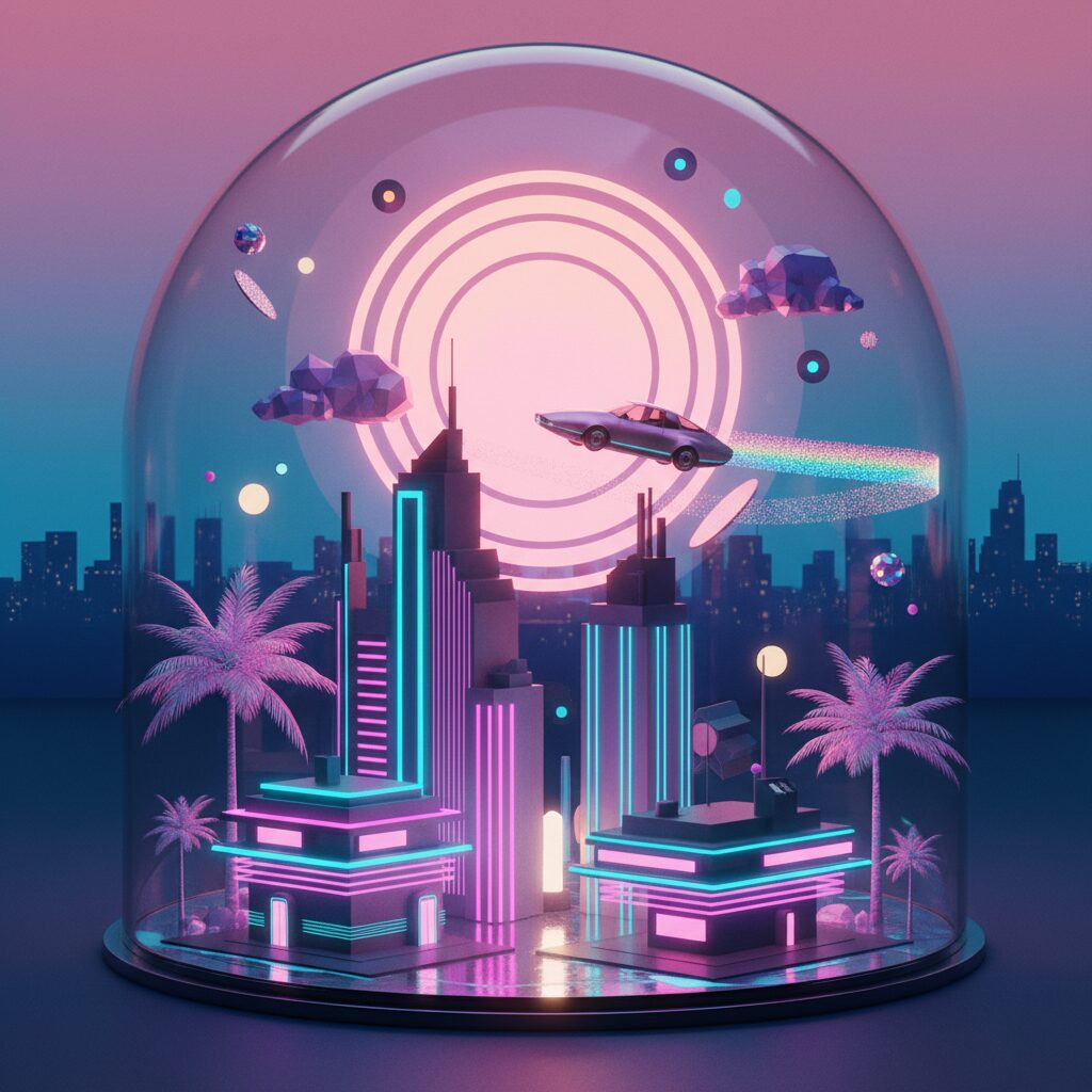
Fuel for the Vaporwave Flame
City Pop’s revival coincided seamlessly with the emergence of internet-born microgenres like Vaporwave and Future Funk. These online music scenes were rooted in nostalgia, sampling, and careful aesthetic curation. Vaporwave especially drew from ‘80s and ‘90s consumer culture—elevator music, corporate training videos, early computer graphics—reframing them into a style that was both critical of and nostalgic for late-stage capitalism. City Pop was a treasure trove for these artists. Its smooth, polished production lent itself perfectly to sampling and remixing. More importantly, its visual style was the foundation for the Vaporwave aesthetic. The pastel hues, retro-futuristic cityscapes, and motifs of luxury and leisure were all present. Vaporwave artists and fans took City Pop’s visual language and twisted it, adding Roman busts, Japanese characters, and glitchy, low-fi effects. They captured the same sense of yearning City Pop evoked, but for a different kind of lost paradise: nostalgia for a technologically optimistic past that never fully came to be. The 1970s Japanese dream of a tropical getaway transformed into a 2010s global fantasy of a digital escape. It’s a fascinating cultural feedback loop—a dream born as an escape from Japanese urban reality has now become a new fantasy for those seeking refuge from the hyper-connected, often anxious digital world.
So, What Does This Tell Us About Japan?
So we come full circle. We’ve observed the what—the pools, the cars, the endless sunsets. We’ve delved into the why—the economic boom, the urban grind, the longing for escape. But what does this entire phenomenon truly reveal about Japan, beyond the cool tunes and striking images? It unveils a fundamental aspect of Japanese culture: the skillful creation and appreciation of idealized, self-contained worlds. This goes beyond music. Consider a traditional Japanese garden. It’s a highly artificial, carefully controlled miniature of nature, often situated in the midst of a bustling, chaotic city. It’s a space intended for reflection, an escape from the outside world. Consider the immersive, intricate worlds of anime and manga, which provide fans with a fully realized universe to immerse themselves in. Think of the precision and ritual of a tea ceremony, which transforms a simple act into a moment of focused, aesthetic beauty. The island vibe of New Music album art is a contemporary, pop-culture expression of this very impulse. Confronted with the pressures of a demanding reality, the culture excels at crafting refined, beautiful, and emotionally resonant fantasy spaces. The album art of the ‘70s wasn’t meant to mislead anyone. No one truly believed all of Japan looked like a Hiroshi Nagai painting. Rather, it was a collective daydream. It was a shared agreement to invest in a beautiful idea. It was a visual representation of a national mood—a nation that had worked incredibly hard and was now cautiously, hopefully, dreaming of its long vacation. It captured a moment of growing confidence, a yearning for American-style freedom and leisure, all filtered through a uniquely Japanese lens of aesthetic perfection and quiet melancholy. And that ability to craft such a powerful, captivating dream—one that still enchants people worldwide nearly fifty years later—is one of the most fascinating aspects of Japan. It’s not about the imaginary island; it’s about the very real, deeply human desire to imagine it. And that’s a vibe that’s completely authentic. For real.