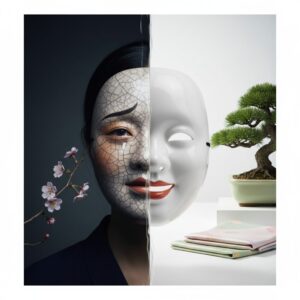

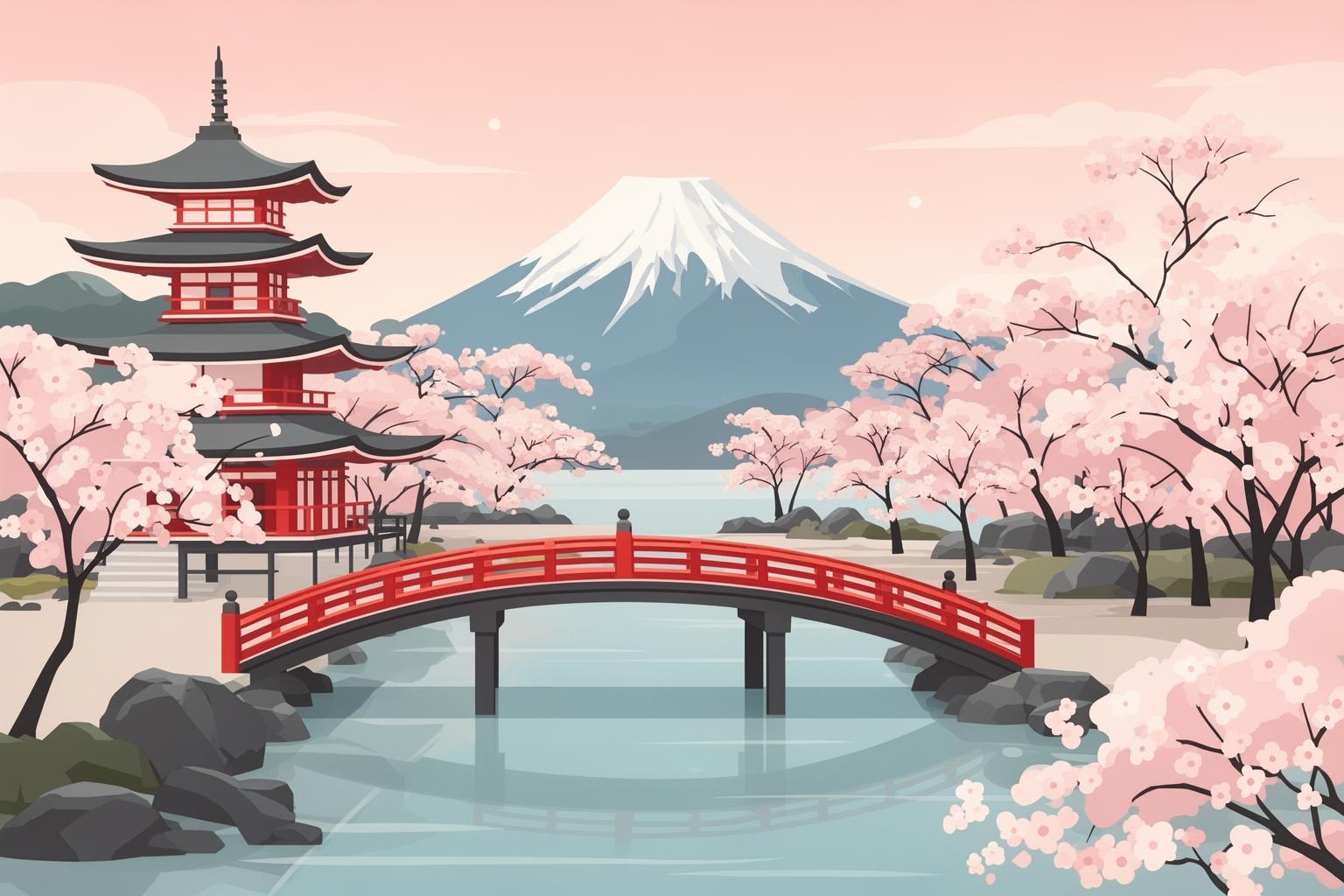
Ever found yourself scrolling through a Japanese website and feeling an immediate, almost subconscious sense of calm? Or perhaps you’ve walked into a Muji store and felt your shoulders relax, surrounded by objects that don’t scream for your attention but simply exist, quietly confident in their purpose. It’s not an accident. This feeling is the result of a deeply ingrained Japanese aesthetic principle known as yohaku no bi (余白の美). The literal translation is “the beauty of white space,” but that simple phrase barely scratches the surface of a philosophy that has shaped everything from ancient ink paintings and garden design to modern branding and digital interfaces. It’s the art of the unsaid, the beauty of the unfilled, the power of the pause. This isn’t just minimalism for minimalism’s sake—a sterile, cold emptiness. On the contrary, yohaku no bi is about creating a space that is full of possibility. It’s an active, breathing emptiness that invites you, the viewer, to participate. It suggests rather than dictates, allowing your own imagination to fill in the gaps and complete the picture. It is the quiet confidence that what is left out is just as important, if not more so, than what is put in. To understand yohaku no bi is to understand a core tenet of the Japanese mindset: that in absence, you can find presence; in silence, you can find meaning; and in space, you can find beauty.
Moreover, this interplay between presence and absence reflects Japan’s nuanced unspoken social code, inviting a deeper exploration of its cultural subtleties.
The Roots of Emptiness: Where Does ‘Yohaku no bi’ Come From?

This deep appreciation for empty space did not simply emerge spontaneously. It is a concept cultivated over centuries, intricately woven from philosophy, religion, and artistic practice. To explore its origins is to grasp why it represents much more than a mere design choice; it embodies a worldview.
Zen Buddhism and the Void (Mu)
The greatest influence on yohaku no bi is unquestionably Zen Buddhism, which came to Japan from China around the 12th century. A core idea in Zen is mu (無), commonly translated as “nothingness” or “the void.” However, this is not a nihilistic, empty void. In Zen philosophy, mu signifies the realm of pure potential, the state preceding form and thought, from which all things emerge. It is the ultimate reality, free from ego and the distractions of the material world. The practice of zazen, or seated meditation, aims to access this state—to still the “monkey mind” and experience the clarity of this fundamental emptiness. This philosophical pursuit of mental and spiritual space has a direct parallel in the visual realm. If true insight and enlightenment stem from clearing the mind of clutter, then it follows that a visual representation of this ideal would be free from extraneous elements. The empty space in artwork becomes a visual metaphor for the Zen notion of mu. It is not merely a background; it is the very substance of potential—a space for the viewer’s mind to enter, explore, and find its own meaning.
Taoist Influences and the Power of the Unseen
Running alongside Zen Buddhism were ideas from Taoism, another ancient Chinese philosophy. The classic Tao Te Ching speaks directly to the utility of emptiness. It emphasizes that a wheel’s usefulness depends on the empty space at its hub that allows the axle to turn. A clay pot holds water because of the void shaped within its walls. A room is livable due to the empty space enclosed by its walls and roof. This Taoist viewpoint offered a practical, concrete framework for understanding the power of absence. It anchored the more intangible concepts of Zen in everyday life. Emptiness was not just a spiritual ideal; it was a necessary function. This blending of Zen’s spiritual void with Taoism’s functional emptiness fostered an aesthetic that honored space not as a lack, but as an essential, defining element.
Ink Wash Painting (Sumi-e) as Visual Philosophy
Perhaps the most direct and exquisite manifestation of these philosophies lies in Japanese ink wash painting, or sumi-e (墨絵). Mastering sumi-e is both a spiritual discipline and an artistic endeavor. Using only black ink, water, a brush, and paper or silk, the artist aims to capture the essence, or spirit, of a subject with the fewest possible strokes. The breathtaking quality of these paintings arises not only from the skillful brushwork but also from the masterful utilization of the unpainted surface. An artist like the 15th-century master Sesshū Tōyō might depict a single pine branch against a vast expanse of white. That white, the yohaku, is not just an empty backdrop. It is the winter mist hanging on the mountainside. It is the silent, snow-blanketed landscape. It is the boundlessness of the sky. The empty space is an active element in the composition, creating atmosphere, depth, and emotion. More importantly, it invites the viewer’s imagination. The artist provides just enough detail—a gnarled rock, a distant peak’s outline—and trusts the viewer to complete the scene mentally. The painting becomes a silent dialogue between artist and viewer, mediated by the potent emptiness of the page.
Manifestations in Traditional Arts and Spaces
Rooted in these philosophical and artistic traditions, the principle of yohaku no bi spread, influencing the physical and cultural fabric of Japan. It became a foundational guideline for designing spaces, arranging objects, and perceiving beauty in everyday life.
The Calculated Emptiness of the Japanese Garden
The concept of meaningful emptiness is most vividly embodied in a Japanese dry landscape garden, or kare-sansui (枯山水). The garden at Ryōan-ji temple in Kyoto stands as the most renowned example. Here, there are no vibrant flowers, flowing streams, or lush greenery—only fifteen rocks of varying sizes, grouped in clusters on a vast, carefully raked bed of white gravel. From any viewpoint, only fourteen rocks can be seen at once. This garden serves as a profound meditation on space. The white gravel is not mere filler; it represents yohaku, symbolizing the vast ocean or the endless sky. Raking it into precise lines is a form of active meditation, bringing mindfulness and order to the emptiness. The rocks act as islands within this void, their positioning creating a dynamic tension and calm harmony. The space between the rocks holds equal significance, defining their relationship and guiding the observer’s gaze. The garden is meant not for passive viewing but for contemplative engagement, encouraging the mind to transcend the physical elements and grasp the meaning embedded in the space itself.
Floral Arrangement (Ikebana): Sculpting with Space
Western floral arrangements often emphasize dense, symmetrical bouquets bursting with color and texture, aiming for abundance. In contrast, Japanese flower arrangement, ikebana (生け花), embraces a philosophical opposite. Ikebana focuses less on the flowers alone and more on the overall composition: the lines of the stems, the shapes of the leaves, and, most importantly, the surrounding space. An ikebana piece might feature a single elegant branch, a few leaves, and one flawless blossom. The art lies in asymmetry, balance, and crafting a dynamic shape. The negative space around the arrangement is integral to the composition. It highlights each natural element’s unique form, allowing it to be appreciated independently. By removing the unnecessary, the ikebana artist unveils the essential beauty of the plant. The yohaku provides the arrangement with breathing room, both visually and spatially, producing a tranquil elegance that a dense bouquet cannot achieve.
Architecture and the Concept of ‘Ma’ (間)
In Japanese architecture, the appreciation of empty space is captured by the concept of ma (間). Though closely related, ma differs slightly from yohaku. While yohaku generally refers to blank space on a surface, ma signifies the interval—the space or pause between elements. It is an active, vibrant pause. Consider the silence between musical notes, which imparts rhythm and meaning to the melody. In a traditional Japanese home, ma is present throughout. Rooms (washitsu) are sparsely furnished. Instead of fixed, heavy walls, spaces are divided by lightweight sliding panels (fusuma and shoji), allowing flexibility and fluidity. Rooms can be opened to create a large space for guests or divided into smaller, intimate areas as needed. A room’s focal point is often the tokonoma, an alcove that displays a single calligraphy scroll or simple ikebana arrangement. The remainder of the room remains open. This uncluttered space is not viewed as empty but as space filled with potential, its purpose defined by the activities it accommodates rather than fixed furnishings. The emptiness fosters calm, enabling focus and appreciation of subtle beauties—the wood grain, the tatami’s texture, the light filtering through paper screens. This architectural style prioritizes experience over accumulation.
‘Yohaku no bi’ in the Modern World: From Muji to the Web
While its origins are ancient, yohaku no bi is far from being a mere relic of history. This aesthetic sensibility is arguably more influential today than ever, shaping contemporary Japanese design and resonating with a global audience fatigued by visual clutter and information overload.
The Muji Philosophy: “No Brand, Quality Goods”
If any company exemplifies the modern spirit of yohaku no bi, it is Muji. The company’s full name, Mujirushi Ryōhin (無印良品), means “no brand, quality goods,” which lies at the heart of its philosophy. Muji products are stripped of all unnecessary decoration and branding. Packaging is minimal, often brown or transparent. The products themselves, ranging from stationery to furniture to clothing, are characterized by simple forms, neutral color palettes, and functional integrity. This is yohaku put into practice in consumer goods. By removing the “brand”—the logos, bright colors, and marketing slogans—Muji creates a kind of emptiness. This space allows the product’s true qualities to come forward: thoughtful design, quality materials, and usefulness. The absence of branding also serves as an invitation. A Muji notebook or storage box does not impose an identity on its owner; it acts as a blank canvas, ready to integrate effortlessly into anyone’s life. The aesthetic is calming because it never shouts. It quietly asserts that good design and quality need no loud declaration.
Japanese Graphic Design and Web Interfaces
Applying this philosophy to a two-dimensional canvas gives rise to the clean, elegant realm of modern Japanese graphic and web design. While Japan is also known for its chaotic, information-dense websites (consider the Rakuten homepage), there exists a parallel, influential design school deeply rooted in yohaku no bi. Designers like Kenya Hara, Muji’s longtime art director, emphasize the power of white space. In posters, book covers, and user interfaces, generous use of empty space is not wasted but a vital tool to create focus, establish hierarchy, and enhance legibility. Websites designed with yohaku principles feel luxurious and respectful of the user’s time and attention. They guide the eye naturally to key information, preventing cognitive overload. The space around text and images lends them weight and significance, creating a visual pause—a moment for users to breathe and absorb content without feeling rushed or overwhelmed. This approach sharply contrasts the dominant Western digital aesthetic, which often fills every pixel with content, ads, and calls to action.
The Art of Presentation: Food and Beyond
The principles of yohaku no bi extend even to the dinner plate. In Japanese cuisine, especially in the refined art of kaiseki (traditional multi-course dining), presentation is essential. The plate is a canvas, and the food is arranged with the same care as rocks in a Zen garden. A dish may feature just two or three exquisitely prepared seasonal ingredients—a slice of pristine sashimi, a sprig of a mountain vegetable, a single glistening sphere of salmon roe. These components are artfully placed on a large, beautiful ceramic plate, leaving much of it empty. This yohaku serves several purposes. It highlights the exceptional quality, color, and texture of each ingredient, treating them with reverence. It allows the diner to appreciate each element individually before tasting. Visually, it forms a striking composition that is both simple and deeply sophisticated. It conveys that the experience is not about filling the stomach but about savoring a deliberate, curated moment. The emptiness on the plate elevates the food beyond mere sustenance into a form of art.
More Than Just Minimalism: The Psychological Impact of Emptiness
It’s easy to glance at a Muji product or a Zen garden and simply label it “minimalist,” but that term doesn’t fully capture the essence of yohaku no bi. Western minimalism often focuses on reduction for the sake of simplicity and function, an aesthetic of “less is more.” Yohaku no bi also embraces the idea of “less is more,” yet with a different intention. The emptiness is not the final objective; it marks the beginning of a dialogue.
Inviting Participation, Not Dictating Experience
The fundamental psychological purpose of yohaku no bi is to engage the viewer as an active participant. By leaving something unsaid, unpainted, or unfilled, the creator places trust in the audience. A sumi-e painter doesn’t depict every needle on the pine tree; instead, they paint the essence of the pine and trust that your mind will fill in the rest. A garden designer sets rocks within an open gravel field and trusts that you will ponder their significance. This act of completion becomes deeply personal and engaging. It transforms viewing from a passive reception of information into an active process of creation and interpretation. The artwork or design gains depth because a piece of you now resides within it. This contrasts with much Western art and design, which often aims to deliver a complete, unambiguous message, leaving little room for personal imagination.
A Counterpoint to Information Overload
In today’s world, we are overwhelmed by a constant barrage of information. Our screens flash with notifications, cities are plastered with advertisements, and social feeds scroll endlessly. This unceasing sensory input fosters a persistent cognitive burden. Within this context, the philosophy of yohaku no bi feels less like a mere aesthetic choice and more like a vital remedy. It offers sanctuary. The empty space on a page, the uncluttered surface of a desk, the stillness in a room—these moments provide visual and mental calm. They create space to think, to feel, and simply to be, without the pressure to respond. It is an aesthetic of respect—respect for the materials, respect for the subject, and most importantly, respect for the viewer’s attention and intellect. It quietly resists the noise of modern life, reminding us that clarity and peace come not from adding more, but from skillfully removing excess.
Ultimately, yohaku no bi teaches a lesson that reaches beyond art and design. It’s a perspective that values the pause between words, the quiet interludes in a day, and the open spaces within a home. It shows that what we choose to leave out shapes what we include. It recognizes that true richness often lies not in abundance, but in thoughtful simplicity. It acknowledges that sometimes the most powerful statement is whispered, leaving behind a vast and beautiful silence for us to fill with our own meaning. The beauty lies not just in the object itself, but in the space that allows the object to exist.