Ever fall down a YouTube or Spotify rabbit hole and land on a playlist of 90s Japanese music that feels… different? Like, you’ve been teleported into a sugar-coated, hyper-stylized version of Tokyo that feels simultaneously retro and futuristic. The music is a dizzying mashup of French pop, bossa nova, swinging 60s lounge, and breezy jazz, all filtered through a lens of pure, uncut pop optimism. Chances are, you’ve stumbled into the world of Shibuya-kei. But here’s the real question that hits you when you start looking at the album covers and music videos: how did this music get such a specific, unified, and instantly recognizable look? It’s more than just a genre; it’s a whole aesthetic, a complete vibe. You see a Pizzicato Five album cover and you just know what it’s going to sound like. This wasn’t some happy accident. The visual identity of Shibuya-kei wasn’t just a wrapper for the music; in many ways, it was the instruction manual for the entire subculture. The sound and the visuals were born from the same creative impulse, a masterclass in world-building that turned a music scene into a lifestyle brand before that was even a common phrase. To get why this music looks the way it does, you have to understand that the graphic design wasn’t an afterthought—it was the mission statement. It was a meticulously crafted invitation to a cooler, more curated version of reality, centered squarely in the heart of Tokyo’s most fashionable district.
This meticulous curation of a visual identity echoes other uniquely Japanese aesthetics, such as the way certain artists have transformed traditional monsters into an adorable vibe.
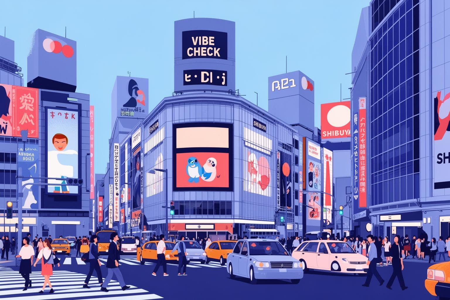
The 90s Vibe Check: What Was Even Happening in Japan?
To truly understand the visual language of Shibuya-kei, you need to rewind to Japan in the early 1990s. The country was essentially recovering from a massive economic hangover. The extravagantly opulent “Bubble Era” of the 1980s—a period marked by corporate excess, stock market madness, and legendary spending—had burst, dramatically. The following decade, often referred to as the “Lost Decade,” was one of economic stagnation and social introspection. The party had ended, and Japan was waking up with a pounding headache, wondering what to do next.
This shift in mood was vital for the youth culture that gave rise to Shibuya-kei. The loud, logo-laden, brand-obsessed mentality of the 80s suddenly seemed tired and somewhat cringeworthy. Instead of striving for a corporate job and a flashy car, a new generation of young people began looking inward and backward. They became cultural archaeologists, digging into the past to find something more authentic, personal, and frankly, more interesting. This was not about mainstream success; it was about cultivating impeccable taste. It marked the birth of the curator as a cultural hero.
Young people in Tokyo weren’t seeking inspiration from the future; they were digging through their parents’ record collections, discovering Serge Gainsbourg and Burt Bacharach. They were watching classic French New Wave films by directors like Jean-Luc Godard. They were scouring thrift stores in Shimokitazawa and Koenji for vintage 60s clothing. This cultural moment was less about creating something entirely new and more about a sophisticated act of remixing. It involved taking diverse elements from different eras and cultures—French ye-ye pop, Italian lounge music, American jazz, British indie—and reassembling them into something fresh, playful, and uniquely Japanese. This environment, this obsession with curation and deep-cut knowledge, was the rich soil from which Shibuya-kei’s entire aesthetic—both sonic and visual—would emerge. It was a movement driven by otaku (a term that really means enthusiast or geek) sensibilities, where your deep knowledge of obscure records or vintage design was your social currency. The aim wasn’t wealth; it was to be in the know.
More Than Just a CD Cover: The Visual Architects of Shibuya-kei
The visual identity of Shibuya-kei was neither accidental nor a fleeting trend. It emerged from a close-knit community of musicians, designers, and stylists who shared the same cultural atmosphere and visual language. The CD jewel case was more than packaging; it served as a 4.7-inch square canvas representing an entire worldview. A few key figures played a crucial role in shaping this aesthetic, transforming album art into a powerful tool for building the subculture’s mythology.
The King of Kitsch: Hideki Nakajima and Pizzicato Five
If you picture Shibuya-kei, the image that probably comes to mind is a Pizzicato Five album cover designed by Hideki Nakajima. Nakajima was the visual genius behind the group’s most iconic era, perfectly capturing the scene’s playful, maximalist, and cosmopolitan energy. His designs are vibrant explosions of pop art, a chaotic yet perfectly balanced collage of influences. Viewing his album art for Made in USA or Happy End of the World offers a condensed lesson in the ethos of Shibuya-kei.
Nakajima’s style was pure retro-futurism, mixing the bold graphic style of 1960s spy movie posters with the clean lines of Swiss modernism and an abundance of vivid Japanese pop colors. His layouts brimmed with detail and imagery. Vocalist Maki Nomiya appears as a chic secret agent, a globe-trotting stewardess, or a mod fashion icon, surrounded by a vibrant whirlwind of hot pinks, electric oranges, and sky blues. Typography played a major role, often featuring sleek mid-century sans-serif fonts like Helvetica, arranged dynamically and asymmetrically to evoke both chaos and deliberate design. He delighted in layering elements: photos were cut out and set against flat color backgrounds, text wrapped around images, and small graphic symbols and icons scattered throughout. This was a visual form of sampling—he sampled design history itself, taking fragments from vintage magazines, airline branding, and film posters to remix them into a sophisticated, high-energy whole. The result was a fantasy world—a never-ending cocktail party where everyone was witty, well-dressed, and possessed encyclopedic pop culture knowledge. The album art wasn’t merely selling a record; it was selling an aspirational lifestyle.
Flipper’s Guitar and the Rise of “Le Style”
On the other side of the Shibuya-kei aesthetic spectrum were Flipper’s Guitar, the duo of Keigo Oyamada (later known as Cornelius) and Kenji Ozawa. If Pizzicato Five represented the exuberant, champagne-popping extroverts of the scene, Flipper’s Guitar embodied the thoughtful, turtleneck-wearing intellectuals. Their visual identity, shaped largely by the design house Contemporary Production led by Mitsuo Shindo, reflected this perfectly. Their aesthetic was cooler, more restrained, and deeply influenced by European indie culture, particularly the understated chic of French pop and British indie labels like Sarah Records or Postcard Records.
Where Nakajima’s work was a riot of color, Flipper’s Guitar’s world was often presented in stark black-and-white or muted, washed-out tones. The cover of their landmark album Camera Talk exemplifies this approach, featuring a simple, candid-style black-and-white photo of the band looking contemplative and a bit serious. The typography is elegant and clean, often employing classic serif fonts that suggest a literary or cinematic sensibility. The entire presentation felt less like a pop album and more like the cover of an indie film journal or poetry collection. This was intentional, a form of signaling. The aesthetic communicated a different kind of cool—one rooted in intellectualism, refined taste, and subtlety. It conveyed that this wasn’t throwaway pop music but art. It spoke to listeners who read, watched foreign films, and understood sophisticated cultural references. This minimalist, Europhile style became hugely influential, establishing a blueprint for a more subdued and introspective branch of Japanese indie music and design that endures today.
The Readymade Aesthetic: Konishi Yasuharu’s Curation Game
No discussion of the Shibuya-kei aesthetic is complete without highlighting Yasuharu Konishi, the leader and chief creative mind behind Pizzicato Five. Konishi was more than a musician and songwriter; he was a cultural DJ and master curator who applied his encyclopedic knowledge of music, film, and design to all his work. His philosophy was rooted in the concept of the “readymade,” an idea borrowed from artist Marcel Duchamp, which asserts that selecting and re-contextualizing existing objects is a creative act in itself. For Konishi, a forgotten bossa nova track, a line from a Godard film, or a 1960s airline menu font were all raw materials to be sampled and repurposed.
This philosophy extended directly into Pizzicato Five’s visual identity. Their album art, music videos, and press photos were extensions of this curatorial process, meticulously assembled collages of “cool things.” The visuals were filled with references for fans to decode. Maki Nomiya’s styling echoed fashion icons like Audrey Hepburn or Twiggy. Graphic elements borrowed color palettes from Andy Warhol prints or layouts from vintage Blue Note jazz records. This was not plagiarism but a heartfelt, obsessive homage that created a rich, intertextual world around the band. Experiencing Pizzicato Five wasn’t passive; it invited listeners to join a secret club. The album cover was the first clue in a cultural scavenger hunt—if you recognized the font, understood the film reference, or caught the fashion nod, you were part of the tribe. Konishi’s brilliance lay in recognizing that in the information-saturated 1990s, the ultimate creative act was not invention but selection. He curated a fantasy world and sold the soundtrack to it.
The DNA of the Design: Deconstructing the Shibuya-kei Look
So, when you distill it all down, what are the essential elements of the Shibuya-kei visual identity? It’s a unique blend of recurring motifs and design philosophies that, combined, forged a distinct and highly influential aesthetic. Understanding these key components is vital to appreciating why the style was so powerful and why it stood out from contemporary music visuals in Japan and abroad.
Retro-Futurism: Viewing the 60s as the Coolest Future
Central to the Shibuya-kei aesthetic is a profound fascination with the 1960s. However, it wasn’t simply a nostalgic longing for the past. Instead, it was a very particular, idealized vision of the 60s as an era of limitless optimism, space-age innovation, and unmatched stylistic cool. For young Japanese people enduring the economic stagnation of the “Lost Decade,” the 60s symbolized a lost paradise—a world of sleek Eames furniture, playful Verner Panton designs, sharp Pierre Cardin suits, and the promise of a bright, technologically advanced tomorrow. This wasn’t the complex, political 60s of reality; it was a fantasy 60s shaped by movies, magazines, and design archives. The album art served as a time machine, a gateway to this more exciting, stylish era. Frequent use of go-go dancers, mod aesthetics, and Space Race imagery tapped into that vibrant energy. It was a form of escapism, yes, but also a creative declaration: the most thrilling future we can envision is one that looks like the most optimistic version of the past.
Typography as a Defining Element
In Shibuya-kei design, fonts were never mere letters. They were integral characters, carrying cultural meanings and signaling distinct values. There was a clear preference for clean, modernist, sans-serif typefaces, especially Helvetica and Futura. This was a deliberate choice. With roots in the Bauhaus movement and Swiss graphic design, these fonts conveyed rationality, sophistication, and a cosmopolitan cool. Using Helvetica on album covers instantly connected the music to a tradition of refined European design, contrasting sharply with the grungy, handwritten fonts of American alternative rock or the ornate calligraphy typical of traditional Japanese aesthetics. This made the album feel like a piece of imported luxury, a product of cultivated taste. The typography was neat, organized, and confident, implying that the music within was equally well-designed and thoughtfully crafted.
The Influence of Collage and Sampling
The most significant technique in Shibuya-kei’s music and visuals is sampling or collage. This is the key to understanding the entire movement. Just as musicians would borrow a drum break from an old funk record, a string section from an easy listening piece, and a vocal melody from a French pop tune, the graphic designers mirrored this approach visually. They’d combine a photo from a vintage fashion magazine, a pattern from a 60s textile, a logo from an old airline, and a color palette from a Warhol print into a single cohesive image. This shared method is what perfectly synchronized the sound and visuals. Both were acts of curation and re-contextualization. The album art didn’t just illustrate the music; it was created using the same imaginative process. This approach celebrated DJs and designers as cultural archaeologists, uncovering forgotten treasures and refining them for new audiences.
Tokyo as a Boutique, Not a Mega-City
Lastly, the Shibuya-kei aesthetic offered a very particular vision of its home city. It wasn’t the sprawling, overwhelming, Blade Runner-like Tokyo imagined by the West. Instead, Tokyo was portrayed as a curated, walkable, and remarkably stylish neighborhood. The scene was geographically anchored around record stores, cafes, and chic boutiques in Shibuya and nearby areas like Daikanyama and Shimokitazawa. Magazines linked to the scene, like Olive, published maps highlighting these trendy spots, turning the city into a real-life video game level for readers to explore. The album art echoed this sense of place. It wasn’t about grand cityscapes but about intimate, cool locations within the city—a stylish café interior, a street-style photo, a snapshot in front of a legendary record store like HMV Shibuya, a key hub for the scene. The visuals helped to mythologize the neighborhood itself, transforming Shibuya into a brand and destination—a physical embodiment of the aesthetic where fans could experience the lifestyle the album covers promised.
So, Why Did It Matter? The Legacy of a Look
It might be easy to dismiss Shibuya-kei’s visual obsession as superficial fluff, a triumph of style over substance. However, that would completely miss the point. The movement’s intense focus on aesthetics was radical because it argued that style was substance. The carefully crafted look was not merely packaging; it formed a fundamental part of the artistic message. The impact of this approach is vast and still resonates today, both in Japan and worldwide.
Within Japan, the Shibuya-kei aesthetic spread beyond the music scene and shaped an entire generation of design and culture. The style of magazines, café interiors, and fashion in Harajuku’s streets all absorbed elements of that retro-modernist, meticulously curated cool. It helped establish the concept of the “lifestyle brand,” where the offering extends beyond a product to encompass an entire universe of taste. Moreover, it laid the foundation for subsequent Japanese art movements, such as Takashi Murakami’s Superflat theory, which critically explores the blending of high and low culture and the otaku-driven remixing of pop imagery that Shibuya-kei had enthusiastically pioneered.
Globally, the influence of Shibuya-kei is widespread, even if its origins aren’t widely recognized. The entire aesthetic of a Wes Anderson film, with its carefully styled, retro-inspired production design and curated soundtracks, feels like a spiritual heir. The look of trendy, minimalist coffee shops worldwide owes much to the café culture that flourished in Tokyo during that period. The international achievements of Japanese brands like Uniqlo and Muji, which promote a clean, well-designed, and understated lifestyle, rest on the same principles of refined taste and mindful curation that Shibuya-kei advocated. Even the worldwide phenomenon of “lo-fi hip hop beats to study/relax to” on YouTube—with its anime-influenced, nostalgic, and slightly melancholic visual loop—is a direct descendant. It’s music serving as an atmospheric backdrop for a particular lifestyle, a concept Shibuya-kei perfected.
Ultimately, Shibuya-kei’s most significant contribution was popularizing the notion that your taste defines your identity. In a pre-social media era, a Shibuya-kei CD functioned much like an Instagram profile. It communicated your interests, influences, and aspirations. It signaled that you were someone who appreciated a deep cut, understood the references, and valued aesthetics. The album art acted as the filter, the bio, and the grid all at once. It offered a complete toolkit for a new kind of cool—one focused less on rebellion and more on connoisseurship. The vibe wasn’t just in the music; it was boldly displayed on the cover, a vibrant, pop-art blueprint for a more stylish life.