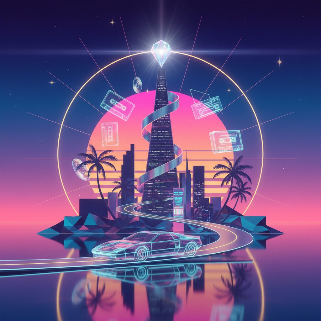
Yo, what’s the deal? You’re scrolling, minding your own business, and the YouTube algorithm, this all-knowing digital oracle, slides something into your feed. The title is in Japanese, maybe something like 「プラスティック・ラブ」 or 「真夜中のドア」. The thumbnail? It’s a vibe. A whole mood. It’s a crisp, clean illustration of a sun-drenched swimming pool next to a ridiculously blue ocean, or maybe a lone convertible cruising down a coastal highway at sunset. The colors are insane—soft pinks, cool teals, creamy oranges. It looks like a memory of a vacation you never took. You click. And the sound… it’s smooth, funky, impossibly chic. It’s City Pop. And just like that, you’re down the rabbit hole. But after the tenth track, you start to wonder. This music is from 80s Japan, but the art looks like a fantasy version of Miami or L.A. Why the palm trees? Why the pastel overload? Why does it feel so nostalgic for a time and place that never really existed? It’s a legit head-scratcher. As someone who’s spent a ton of time trying to bridge the gap between different East Asian cultures, this aesthetic puzzle totally snagged my attention. It’s not just “retro.” It’s a hyper-specific, curated dream world. It’s pop, it’s kawaii, but in a way that’s hard to pin down. So, let’s get into it. Let’s peel back the layers of these sun-bleached, neon-soaked album covers and figure out not just what they look like, but why they look that way, and what they tell us about the dream state of bubble-era Japan.
To understand this curated dream world, it helps to see how other Japanese music scenes, like Shibuya-kei, were also defined by their visual aesthetic.
The Economic Miracle’s Soundtrack: Setting the Scene
Before we even begin discussing the art, we need to set the context. You can’t fully grasp the City Pop aesthetic without recognizing the extraordinary economic boom Japan experienced in the late 1970s through the 1980s. This wasn’t merely a strong economy; it was a phenomenon, rightly called the “Bubble Economy.” After decades of intense and focused rebuilding following World War II, Japan had become a global economic powerhouse. The atmosphere was one of pure, unfiltered optimism, as if the celebration would never end. For the first time in modern Japanese history, a generation grew up surrounded not by scarcity, but by abundance. They had disposable income, and an entirely new consumer culture emerged to cater to them.
This generation differed from their parents, who were shaped by sacrifice and reconstruction. Instead, they were defined by leisure, technology, and style. They purchased brand-new cars not merely for practicality, but as statements of identity. The Honda Prelude and Toyota Soarer became icons of this new urban sophistication. Their apartments were equipped with cutting-edge stereo systems from Sony and Technics, perfect for playing the era’s refined sounds. They traveled both domestically to new resort areas like Okinawa and Izu, and internationally to destinations that had once seemed only attainable in films—Hawaii, Guam, and the U.S. West Coast. This sparked a cultural shift, shifting focus from collective well-being to individual enjoyment and aspirational lifestyles. The city, especially Tokyo, became the quintessential playground, filled with gleaming skyscrapers, stylish cafes, designer boutiques, and exclusive nightclubs.
The music born from this environment became its natural soundtrack: City Pop. It was a sophisticated blend, a musical cocktail mixing Western genres such as AOR (Album-Oriented Rock), soft rock, funk, soul, and disco with a uniquely Japanese melodic touch. Artists like Tatsuro Yamashita, Mariya Takeuchi, Toshiki Kadomatsu, and Anri produced music that was polished, layered, and exceptionally smooth. It was music for adults, capturing themes of romance, melancholy, and the bittersweet freedom of urban life. It was perfect for a late-night drive along the Shuto Expressway, with Tokyo’s lights blurring into vibrant neon streaks. It was the soundtrack for sipping cocktails at a hotel pool bar overlooking the ocean. The music sold a fantasy, a lifestyle. And if the music was the script, the album art was the movie poster—it had to visually embody and promote that same dream, sleek, aspirational, and optimistic like the tunes within.
Deconstructing the Visual Language: The Key Ingredients of City Pop Art
When you look at a classic City Pop album cover, you’re not merely seeing an image. You’re encountering a carefully crafted collage of aspirational symbols—a visual language intended to transport you. It’s a kind of formula, but an ingenious one. Artists who defined this era, like Hiroshi Nagai and Eizin Suzuki, were experts at setting a mood. They sold a feeling and employed a specific palette of elements to create it. Let’s examine the key features of this visual lexicon to understand how they assembled this utopian dreamscape, piece by piece.
The American Dream, Reimagined and Refined
One of the first impressions is the pervasive presence of an idealized paradise that resembles America. This paradise is an almost mythical version of California, Miami, or Hawaii. The visual shorthand is immediate and striking: endless blue skies, towering palm trees, pristine swimming pools casting sharp, geometric shadows, and the sparkling Pacific Ocean extending to the horizon. It’s an aesthetic of eternal summer and unlimited leisure. Tatsuro Yamashita’s iconic 1982 album “For You,” illustrated by Eizin Suzuki, is a prime example. It showcases classic American cars, a retro diner, and a sense of expansive space that feels distinctly non-Japanese.
But why the fascination with America? Considering the post-war context helps. America symbolized the height of modernity, wealth, and cool for decades. American movies, music, and fashion were strong cultural exports that influenced the aspirations of youth worldwide, Japan included. There was a deep admiration for this seemingly carefree, sun-drenched lifestyle. For a generation growing up in crowded Japanese cities, the notion of open roads, private pools, and endless beaches was the ultimate fantasy. The creators of this album art weren’t simply replicating American scenes; they filtered them through a Japanese perspective. They refined, sanitized, and perfected these raw symbols of American leisure. Hiroshi Nagai is the undisputed master of this style. His work, featured on albums by Eiichi Ohtaki and others, exemplifies this aesthetic. His lines are impeccably clean, his colors flat yet vibrant, and his compositions serene and harmonious. People are either absent or appear as tiny, insignificant figures. The landscape takes center stage. It’s not a real location but a hyper-real essence of a feeling. It’s America as a flawless, tranquil dream, reimagined and polished for a Japanese audience eager to embrace that fantasy.
Urban Fantasies: Tokyo’s Megalopolis as a Playground
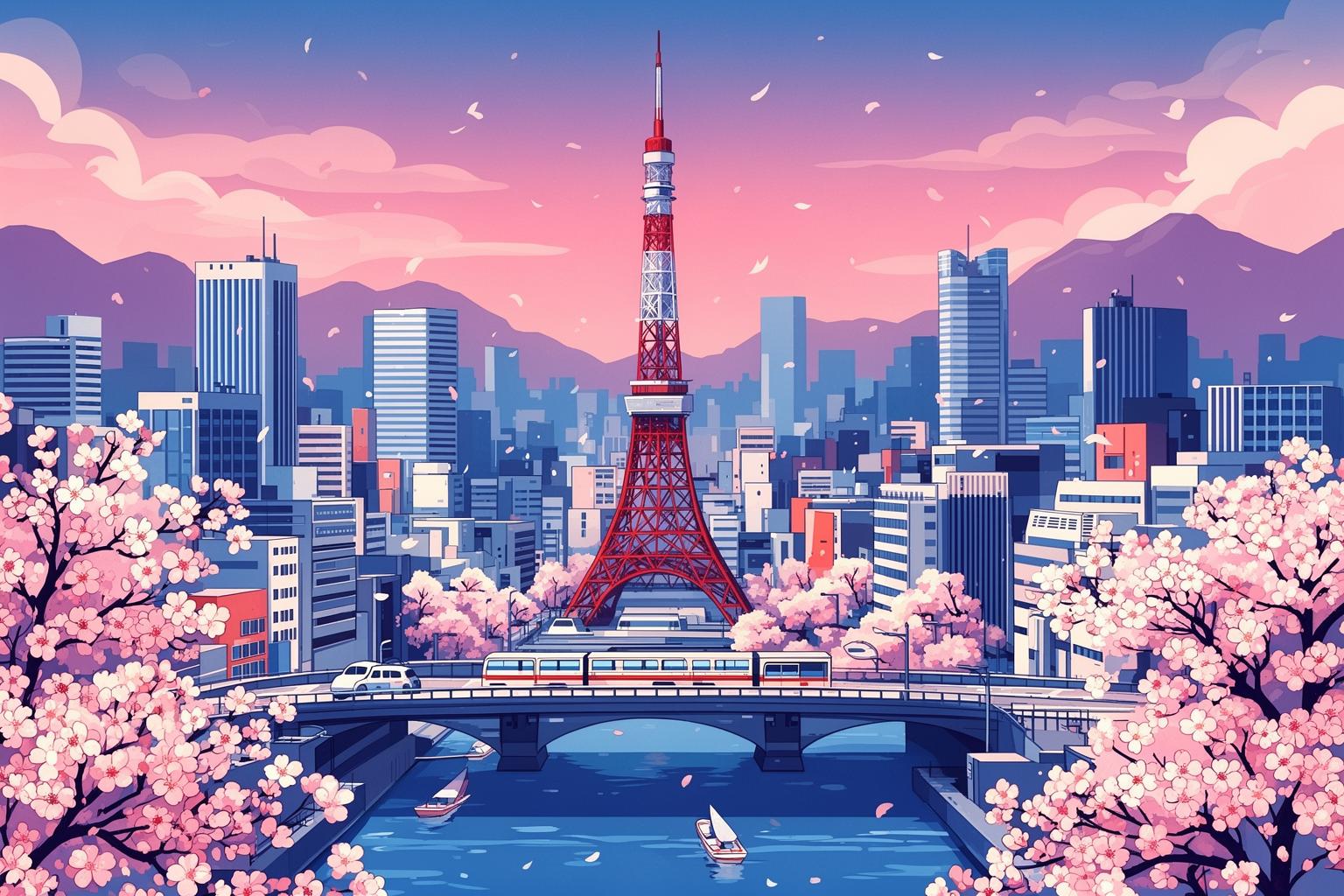
While the beach and resort formed one half of the City Pop dream, the other half was firmly rooted in the city. But this wasn’t the gritty, chaotic city of film noir or punk rock. Instead, it depicted the city as a dazzling, futuristic realm of pleasure and possibility. Album art from this period romanticized Tokyo’s urban environment, turning it into a character itself. We see sleek skyscrapers bathed in the glow of the setting sun, intricate highways glowing with taillights, and skylines painted in soft, dreamy pastels. The city wasn’t a concrete jungle to escape; it was a sophisticated playground to be explored.
Kiyotaka Sugiyama & Omega Tribe’s 1983 album “Aqua City” perfectly captures this spirit. It depicts a fantasy city rising from water, complete with monorails, futuristic buildings, and yachts—blending urban and resort aesthetics into a seamless dream. This artwork reflected the reality of 1980s Tokyo amid a construction boom. The city was evolving, soaring skyward, and felt like the center of the world. The artwork mirrored this optimism and futurism, often emphasizing specific times of day that enhanced the city’s magic: the “magic hour” of dusk, when the sky turns purple and orange and lights begin to glow, or the quiet solitude of dawn. These in-between moments brim with potential and a hint of melancholy, perfectly suiting the mood of the music. The art narrates the story of the cosmopolitan urbanite—someone who works hard in a sleek office by day and cruises the city at night, living a stylishly independent life. For millions of young Japanese relocating to Tokyo for work and new opportunities, this cityscape wasn’t overwhelming or alienating; it was their shimmering personal kingdom filled with promise.
The Pastel Revolution: Color Theory and Kawaii Influences
Beyond its subjects of beaches and cities, the defining hallmark of City Pop’s aesthetic is its color palette. It represents a revolution in soft, dreamy pastels—mint greens, sky blues, flamingo pinks, gentle lavenders, and creamy oranges. These aren’t the bold, aggressive colors of punk or the earthy tones of folk music. Instead, this palette feels fresh, modern, and incredibly gentle. But why these particular colors?
The answer lies deeply in the concurrent rise of kawaii (cute) culture in Japan. By the 1980s, Sanrio characters like Hello Kitty and Little Twin Stars had established a visual language rooted in softness, innocence, and pastel hues. This aesthetic permeated all spheres of Japanese design, from fashion to stationery to advertising and album art. City Pop’s pastel colors extend this influence, softening the sharp, clean lines of modernist architecture and vast, empty landscapes. They create a world that feels safe, pleasant, and inviting—a visual comfort. These hues evoke a distinct mood of gentle, wistful nostalgia. Even bustling city scenes drained of stress or harshness by the pastel palette transform into dreamlike environments. This approach starkly contrasts with contemporary Western pop aesthetics, often louder, more saturated, or confrontational. City Pop’s Japanese style offers a world that is both visually pleasing and emotionally soothing—pop music imbued with subtle restraint and gentleness.
Beyond Cuteness: The Depth of Japanese Pastels
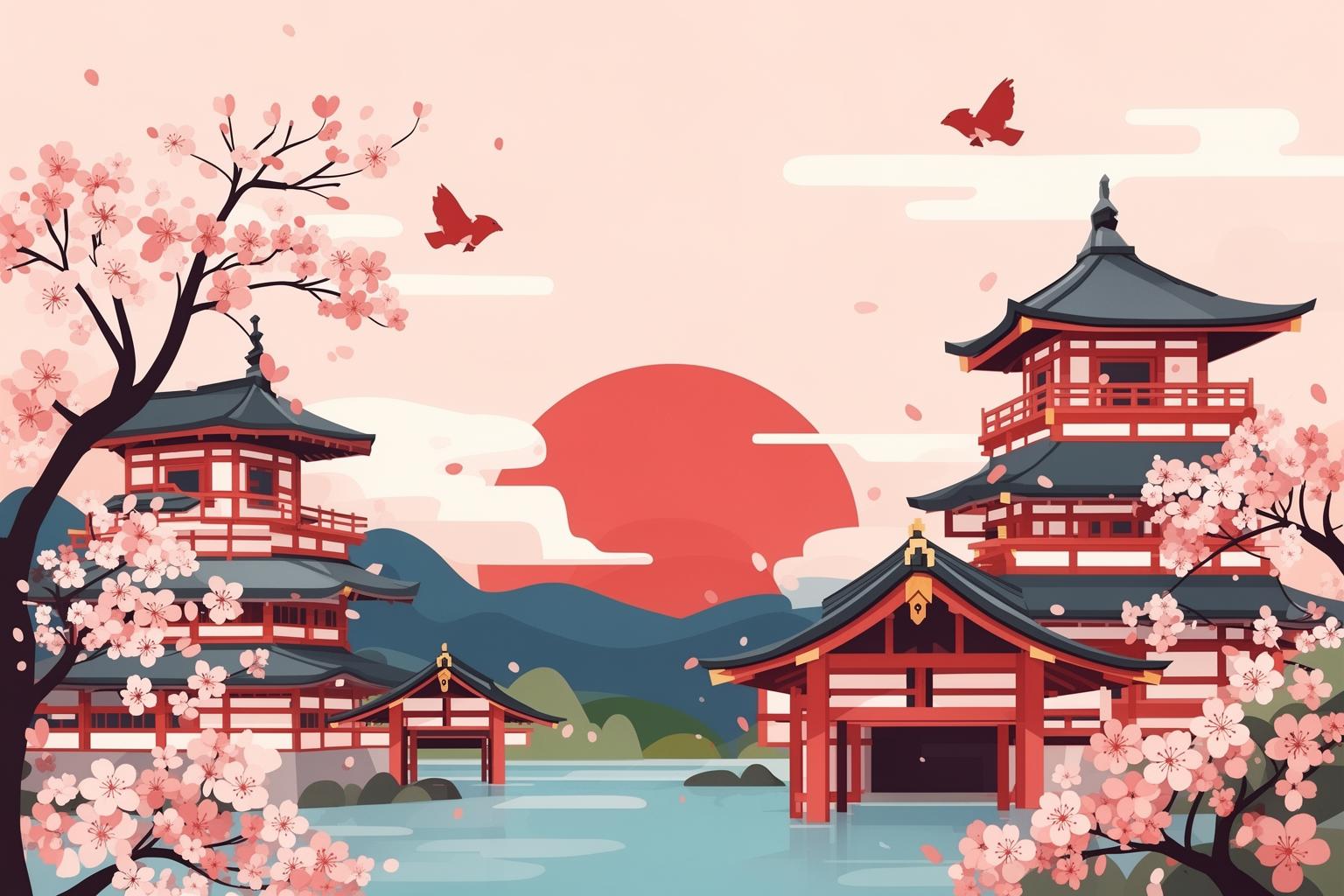
However, it would be an oversimplification to dismiss these pastels merely as “cute.” There’s a deeper aesthetic intelligence at work. The color choices resonate with traditional Japanese artistic principles. For instance, the emphasis on the magic hour—dusk and dawn—recurs frequently. These times, marked by naturally soft and blended colors, are cherished in Japanese culture for their transient beauty, linked to mono no aware (an empathetic awareness of impermanence). The pastel palette is ideally suited to capturing this fleeting, poignant melancholy. Additionally, these detailed illustrations often employ a sophisticated use of empty space, or ma, a fundamental concept in Japanese art. Hiroshi Nagai’s vast, cloudless skies exemplify this, giving the compositions room to breathe and evoking peace and tranquility. While the pastel colors are undeniably part of a kawaii sensibility, they are utilized with artistic refinement. This isn’t the simple cuteness of a cartoon but an atmospheric, emotionally resonant use of color that elevates the artwork from mere illustration to a powerful form of world-building.
The Illustrated Ideal: Why Not Photography?
This raises a significant question that might easily be overlooked. In a time when photography was widely accessible, why did so many iconic City Pop albums opt for illustrations rather than photos of the artists? This was a deliberate choice and is essential to grasping the entire concept behind the City Pop aesthetic. A photograph, by its very nature, is anchored in reality. It captures a particular person, in a specific place, at a distinct moment. An illustration, in contrast, is pure imagination. It gives the artist the freedom to craft an idealized, perfected version of reality. It’s about constructing a world, not merely recording one.
This preference for illustration becomes entirely understandable when you consider Japan’s existing visual culture. The country already boasted a rich and sophisticated tradition of commercial illustration, manga, and anime. The visual literacy of the average Japanese consumer was exceptionally high. Artists like Hiroshi Nagai and Eizin Suzuki were far from mere doodlers; they were highly skilled commercial artists who brought a level of polish and vision to their work that rivaled any other form of design. They could create scenes more flawless than any photograph ever could. They could render the sky a more perfect blue, the swimming pool more inviting, the city skyline more dazzling. They were shaping an aspiration, and illustration was the most direct and powerful means to achieve it. The goal wasn’t to depict the musician’s appearance; it was to convey what the music felt like. The illustration was an invitation into the emotional and atmospheric realm of the album.
The Anonymity of the Figure
Exploring this idea further, you’ll notice another subtle yet brilliant pattern in these illustrations. When human figures appear, they are often portrayed in ways that render them anonymous. They might be shown as small silhouettes against vast landscapes, viewed from behind, or have their faces hidden by shadows or sunglasses. Consider the work of Makoto Saito, who created covers for artists such as Yuki Kato. His style is more graphic and abstract, often featuring stylized figures whose identities remain completely ambiguous. Why this anonymity? It’s a clever tactic that serves an important purpose: it enables the listener to project themselves into the scene. You become the person standing on that balcony overlooking the ocean. You are the one driving the convertible down the palm-lined street. By keeping the figures indistinct, the artwork transforms into a personal invitation to enter the fantasy. It’s not about elevating the musician as a celebrity, which was often the focus of Western album art. Instead, it centers on the listener’s experience. The music, the mood, and the lifestyle it embodies are the real stars. The anonymous figure acts as a stand-in for anyone who wishes to belong to that world. This shifts the album cover from being mere marketing into a portal—a direct gateway into the sun-soaked, carefree universe of City Pop.
Beyond the Bubble: City Pop’s Second Life and the Vaporwave Connection
For a long time after the Japanese economic bubble burst in the early ’90s, City Pop and its aesthetic faded into relative obscurity, viewed as a relic of a cheesy, excessive era. Then, something unusual occurred in the 2010s. Thanks to the strange magic of the internet, it surged back to life, gaining a huge new global audience with no ties to ’80s Japan. This resurgence is a phenomenon in itself, deeply connected to the visual impact of the album art.
The comeback was largely driven by nostalgia, but a very particular kind: a nostalgia for a time and place most new fans had never experienced. It’s a longing for the perceived optimism, economic stability, and analog simplicity of that period, sharply contrasting with the complexities and anxieties of the 21st century. The album art acted as the perfect lure. Amid a sea of digital content, these clean, colorful, and instantly captivating images served as ideal click-worthy thumbnails. They promised a world of cool, calm, and sophisticated fun—and the music lived up to that promise.
The Birth of Vaporwave: A Glitch in the Nostalgia Machine
However, this rediscovery wasn’t simply a straightforward revival. The City Pop aesthetic was also appropriated, remixed, and deconstructed by a new, internet-born microgenre: Vaporwave. Vaporwave artists took the sounds and, perhaps more importantly, the visuals of ’80s and ’90s consumer culture—including City Pop—and distorted them. They slowed the music down, added glitches, and drenched it in reverb. Visually, they transformed City Pop’s clean, utopian imagery into something uncanny and dystopian. The pastel colors turned eerie and synthetic. The crisp graphics were degraded with digital artifacts, outdated computer UI elements, and ironic use of Japanese text. Vaporwave scrutinized the polished, consumerist dream City Pop sold and exposed its artificiality. It’s a critique wrapped in the very aesthetic it critiques. While a Hiroshi Nagai painting offers a flawless paradise, a Vaporwave edit might overlay a Windows 95 error message and a glitchy filter, evoking a sense of digital decay and alienation. It takes the original’s optimism and unmasks the melancholic emptiness that may have lurked beneath all along. It poses a powerful question: was that perfect, sunlit world ever real, or just a beautifully crafted advertisement for a dream forever out of reach?
Anemoia and the Algorithmic Echo Chamber
The feeling driving both the straightforward City Pop revival and its Vaporwave deconstruction is best captured by the word anemoia: nostalgia for a time you’ve never known. This is the core experience for most modern City Pop fans. They aren’t reminiscing about their own youth in ’80s Tokyo; they are connecting with a fantasy of what that time might have been, a fantasy built entirely from the music and—crucially—the album art. The YouTube algorithm played a vital role in this. By recommending tracks like Mariya Takeuchi’s “Plastic Love” to millions, it created a global, digital echo chamber. It detached the music from its original cultural context and presented it as a purely aesthetic experience. The album art was the visual hook—the perfect, context-free entry point. It didn’t matter if you didn’t know who Eiichi Ohtaki was; the image of a pool on his A Long Vacation cover conveyed everything you needed to know about the vibe. Together, the algorithm and these images generated a shared, global nostalgia for a past that exists only as a collage of pixels and soundwaves.
The Kawaii Connection: Is City Pop Art “Kawaii”?
Let’s return to one of the key questions: Is this aesthetic, with its refined urban and resort themes, truly kawaii? The answer is a clear yes, but it necessitates a more subtle understanding of what kawaii can signify, particularly for adults in Japan. It’s not the straightforward, childlike cuteness of a plush toy; rather, it’s a more specific, mature interpretation of the principles of cuteness.
Otona Kawaii: “Adult Cute”
The term that best captures the City Pop aesthetic is otona kawaii, meaning “adult cute.” This is a significant cultural phenomenon in Japan, describing a style that is cute yet also chic, sophisticated, and suitable for adults. It’s about integrating the enjoyment and comfort of cuteness into a refined lifestyle without seeming juvenile. Imagine a fashionable woman carrying a designer handbag with a small, cute charm attached, or elegant stationery in delicate pastel shades. It emphasizes aesthetic pleasure, softness, and a hint of whimsy in everyday life. City Pop album art perfectly exemplifies otona kawaii. The pastel color scheme directly connects to the realm of cuteness. The clean, simple lines and well-balanced compositions are both stylish and refined. Themes of leisure, romance, and beautiful scenery feel aspirational and soothing. The whole presentation is crafted to be visually delightful and emotionally reassuring in a way that appeals to mature tastes. It doesn’t ask you to squeal with excitement; it invites you to unwind in a world of gentle, fashionable beauty. It’s the ideal visual expression of a composed, stylish, and sophisticated form of cute.
Escapism as a Form of Cuteness
On a deeper level, the entire City Pop aesthetic can be seen as a form of kawaii because it operates as a powerful means of escapism. At its heart, kawaii culture in Japan often responds to the pressures of a strict and demanding society. Cuteness offers a safe haven—a realm free from conflict, stress, and unpleasantness. The world shown on City Pop album covers is the ultimate sanctuary. In these images, the weather is always perfect, traffic never problematic, and there are no work obligations, deadlines, or social demands. It is an impeccably curated reality where the sole aim is to savor the moment. This idealized, non-threatening world essentially embodies the kawaii urge to create a protective bubble of pleasantness. For the salarymen and office ladies of the 1980s—who worked grueling hours to fuel the economic miracle—these albums served as tools for psychological escape. They could play a record, gaze at the cover, and be transported to an Okinawan resort or a highway in California. Today, amid our own hectic and often stressful environment, this art fulfills the same role. It offers a brief retreat into a world that is simple, beautiful, and deeply gentle. That purpose—the crafting of a safe and charming fantasy world—is one of the most essential expressions of what kawaii truly represents.
What It All Means: The Lasting Legacy of a Sun-Drenched Dream
Looking back at the album art from the City Pop era, it’s far more than just a collection of stylish, retro visuals. It serves as a meticulously detailed and beautifully crafted time capsule capturing a unique moment in Japanese history. It encapsulates the fleeting, sun-drenched height of the Bubble Economy—a period marked by unprecedented economic power, limitless consumer confidence, and an all-encompassing sense of hopeful futurism. The aesthetic represents a masterful cultural blend, merging the aspirational icons of American leisure culture with a distinctly Japanese sense of refined beauty. It transformed the bold, materialistic dream of the West through a delicate filter of pastel tones, precise illustration, and an underlying feeling of mono no aware, that tender melancholy for ephemeral, beautiful moments.
This aesthetic’s powerful resurgence today, resonating with a worldwide audience decades later, stems from the dream it conveys being more compelling than ever. It symbolizes a lost future—one imagined as clean, stylish, and filled with effortless optimism. In a present defined by digital overload, global unease, and environmental fears, the analog, airbrushed perfection of a Hiroshi Nagai or Eizin Suzuki artwork feels like a paradise vanished. The crisp lines, gentle hues, and tranquil, open spaces provide a profound sense of calm and escapism. The art promises that somewhere, the sun is perpetually setting over a glittering ocean, a perfect soundtrack plays on the car stereo, and everything will be alright. It’s a powerful and alluring fantasy. Ultimately, the reason behind it all is remarkably simple: we are all still chasing that endless summer.