Hey loves! Sofia here. So, let’s get real for a sec. You’re scrolling through your feed, planning that dream trip to Japan, and you keep seeing it: these incredibly chic, almost-empty coffee shops. You know the ones—massive concrete walls, a few stark wooden benches, maybe one perfectly placed plant in the corner. You double-tap the pic because the aesthetic is fire, but a part of you is like, ‘Wait, is this a café or a high-fashion bunker?’ It looks cool, for sure, but also… kinda cold? Why are so many of Japan’s coolest third-wave coffee spots ditching the cozy-cluttered vibe for what looks like a minimalist art gallery? Is it just for the ‘gram, or is there something deeper going on? You might feel like you’re missing a piece of the puzzle, and honestly, you’re not wrong. This isn’t just a random design trend; it’s a whole cultural mood board, and today, we’re gonna unpack it all. We’re diving deep into why Japanese minimalism isn’t just about having less stuff—it’s about making space for what truly matters. We’ll spill the tea on ancient philosophies, legendary architects, and how a simple cup of coffee became a full-blown artistic performance. So grab your favorite mug, get comfy, and let’s get to the bottom of this concrete jungle. By the end of this, you’ll not only get it, but you’ll see those stark, beautiful spaces in a whole new light. Promise!
To see how this minimalist aesthetic contrasts with other popular styles, explore the vibrant world of Harajuku’s Y2K cafes.
What’s the Vibe? The Concrete Aesthetic Unpacked
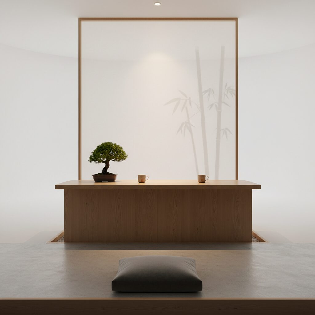
Alright, first things first, let’s set the scene so we’re all aligned. When we refer to the ‘Zen of Concrete,’ what exactly do we mean? Picture stepping off a hectic Tokyo street, filled with neon signs, chirping crosswalks, and throngs of people, and entering a space that offers a complete sensory reset. The initial sensation isn’t the aroma of coffee—it’s the silence. Or more precisely, the quiet. The sound here is different—softer, absorbed by vast, bare poured concrete walls extending from floor to lofty ceiling. These aren’t the coarse, crumbling walls of an abandoned warehouse; they’re smooth, purposeful, with subtle textures like tiny air bubbles and faint lines left by the wooden molds used in casting. The color scheme is strictly neutral, featuring fifty shades of gray—from the pale silver polished concrete floor to the deep charcoal feature wall. Natural materials add warmth but are never overpowering. Think light woods—birch or Japanese ash—for the counter, simple stools, or a long communal table. The furnishings are minimal and functional—no plush sofas or cozy armchairs to sink into. Instead, hard benches or minimalist chairs encourage a more upright, mindful posture. Lighting plays a crucial role. During the day, large windows or skylights flood the space with natural light, beautifully enhancing the concrete’s textures and creating a dynamic play of light and shadow. At night, lighting is carefully considered and often indirect—no flashy chandeliers here. Instead, you might find a few thoughtfully placed spotlights highlighting the barista’s station or a single, elegantly designed pendant lamp casting an intimate pool of light over a table. Even the smallest details are pared down. The menu might be subtly printed on a small card or simply written on a blackboard. There are no loud promotional posters, kitschy decorations, or unnecessary countertop clutter. Everything has its place and feels deliberate. This aesthetic feels both industrial and organic, raw yet refined—a conscious rejection of ornamentation in favor of form, texture, and space itself. This is the backdrop—a muted, spacious, profoundly calm environment that stands in stark contrast to the chaos outside.
Beyond Minimalism: Spilling the Tea on Wabi-Sabi
So, why this particular aesthetic? Here’s the real deal: if you think this is just Japan adopting a Scandi-minimalist style, you’re only catching half the picture. The real insight lies in a concept deeply embedded in Japanese philosophy called wabi-sabi (侘寂). You’ve likely heard the term before, but let’s truly unpack its meaning because it’s the key to understanding these cafes. At its essence, wabi-sabi is a worldview that embraces the transient and imperfect. It’s about discovering beauty in simplicity, humility, and the unconventional. Let’s break down the two elements. Wabi initially described the solitude of living close to nature, apart from society, but evolved into a sense of rustic simplicity, calmness, and an appreciation for understated elegance. It’s about finding contentment in less and celebrating the charm of a plain, unembellished object. Sabi reflects the beauty or tranquility that accompanies aging, where an object’s life and impermanence show through its patina, wear, or visible repairs. It’s the gentle moss on an ancient stone lantern or the crack in a cherished ceramic bowl. Together, wabi-sabi represents the art of valuing beauty that is imperfect, fleeting, and incomplete. So, how does this relate to a concrete wall in a coffee shop? Consider this: a flawlessly painted white wall tells no story—it’s sterile. But a raw concrete wall? It radiates sabi. You notice tiny air pockets, subtle color shifts, and faint imprints from the wooden molds used during curing. These aren’t flaws to hide; they’re records of the material’s making, proof of its honest, authentic nature. This aesthetic honors the material as it is, not disguised as something else. This is wabi. It doesn’t pretend to be luxurious marble or fine wood; it’s simply concrete, and in its genuine simplicity lies profound beauty. This philosophy originated with the traditional Japanese tea ceremony, especially as shaped by tea master Sen no Rikyū in the 16th century. He rebelled against the flashy, extravagant tea culture of his time by advocating for simple, rustic, even imperfect utensils. He demonstrated that a rough, misshapen clay bowl could offer a deeper spiritual satisfaction than a flawless golden one. This spirit is exactly what these third-wave coffee shops are embracing. They aim to create a modern tea house where tranquility and contemplation take center stage. The use of raw concrete and unfinished wood pays direct homage to the wabi-sabi ideal. It serves as a quiet resistance to the mass-produced, overly polished, disposable nature of today’s world. It invites you to slow down, look intently, and find beauty not in sterile perfection but in the genuine, modest, and imperfect character of the surroundings.
The Art of Emptiness: It’s All About ‘Ma’ (間)
Now, let’s discuss all that space. When you enter one of these cafés, the first thing you might notice is the emptiness. Unlike a typical Western café, usually filled with as many tables and chairs as possible, these Japanese spaces can feel expansive and underused. Your immediate reaction might be, “This is bad for business! They could accommodate so many more customers here!” However, this ‘emptiness’ isn’t an error or oversight; it’s a fundamental aspect of the design. It revolves around another key Japanese aesthetic concept: ma (間). Ma is a complex idea without a direct English equivalent. It can be understood as negative space, an interval, a gap, or the space between things. Yet, it represents more than physical emptiness. Ma embodies the power and potential of that emptiness. It’s the pause between notes in music that shapes rhythm and emotional depth. It’s the blank part of a scroll that highlights and sharpens the brushstrokes. In architecture and interior design, ma is the intentional use of empty space to foster calmness, clarity, and focus. It reflects the belief that the space you don’t occupy is as important, if not more so, than the space you do fill. In these concrete coffee shops, ma is evident everywhere. It shows in the generous spacing between tables, offering each visitor a sense of privacy and personal space. It’s in the high ceilings that draw your gaze upward, evoking openness and relief rather than confinement. It’s in the uncluttered surfaces of counters and tables, leaving room for the main attraction—the coffee—to be presented without distraction. This approach contrasts sharply with the Western design tendency to fill every nook and cranny, a style sometimes called horror vacui, or fear of empty space. In many cultures, empty space is viewed as wasted space, but in the Japanese context, it’s breathing room—a deliberate buffer against the sensory overload of modern urban life. Outside, the city is loud, crowded, and relentlessly demanding your attention; inside, the café’s embrace of ma creates a sanctuary. The emptiness isn’t absence; it’s filled with potential—the aroma of freshly ground beans, the subtle hum of the espresso machine, the gentle changes of daylight, and most importantly, your own thoughts. By removing the non-essential, the space offers mental room to focus, reflect, and simply be. The minimalist furniture isn’t just for aesthetics; it defines and honors the ma. Every piece is thoughtfully placed to shape the negative space around it. So when you notice that vast, empty floor space, don’t view it as wasted. See it as an invitation to relax. It’s a physical embodiment of a mental state—a clear, uncluttered mind, prepared to appreciate a single, perfect cup of coffee. The space itself is part of the experience, and its emptiness is its most powerful feature.
The Concrete King: How Tadao Ando Gave Concrete Its Glow Up
You simply cannot discuss Japan’s deep affection for beautiful, raw concrete without giving a huge nod to the legendary Tadao Ando. If wabi-sabi and ma are the ancient philosophical foundations, then Ando is the architect who crafted the modern framework. He transformed concrete—a material often regarded as harsh, cold, and industrial—into something poetic, spiritual, and distinctly Japanese. His impact on the generation of architects and designers behind these coffee shops is immeasurable. Essentially, he gave concrete its renaissance. Ando, famously self-taught, began his career in the 1970s and developed a signature style featuring expansive, silky-smooth walls of exposed concrete. He was obsessive about the quality of his concrete, creating a formula that was dense, waterproof, and possessed a luminous, almost soft appearance. He applied it to design minimalist sanctuaries that often shield occupants from urban chaos while fostering a precise, controlled connection to nature. One of his most iconic works is the Church of the Light in Ibaraki, Osaka. It is a simple concrete box, but the wall behind the altar is pierced by a cross-shaped opening, allowing a striking cross of light to penetrate the dark interior. It’s truly breathtaking. This building embodies all his key elements: the wabi-sabi in the raw, unembellished concrete, the ma in the church’s vast, open interior, and an additional layer—his masterful manipulation of light. For Ando, concrete and light are inseparable partners. The heavy, solid, and dark nature of concrete becomes the ideal canvas for the fleeting, weightless brightness of light. He designs buildings so that, as the sun moves across the sky, light filters in through carefully positioned slits and openings, casting ever-changing shadows on the concrete walls. The structure feels alive, marking the passage of time. This philosophy has deeply influenced contemporary Japanese design. When third-wave coffee shop designers choose exposed concrete, they tap into this enduring legacy. They speak Ando’s architectural language, using concrete to craft a serene, introspective interior—a refuge from the outside world. Expansive windows and skylights aren’t just for brightness; they create a dynamic interplay of light and shadow on textured walls. The coffee shop thus becomes a place not merely to drink coffee but to experience quiet contemplation, observing the shifting light. Ando demonstrated that concrete need not be ugly or oppressive. In his hands, it becomes a medium for tranquility and a connection to elemental forces of light and space. So, when sitting in that minimalist café, you’re not simply in a trendy spot—you’re in a smaller, commercial version of a Tadao Ando masterpiece, a space founded on a philosophy that finds depth in the simplest materials.
Center Stage Coffee: Why the Bare Walls Make the Brew Pop
Alright, so we have the ancient philosophy of wabi-sabi, the concept of space known as ma, and the architectural influence of Tadao Ando. But let’s bring it back to the main reason you’re here: the coffee. Why does this minimalist, concrete-heavy design so perfectly align with the third-wave coffee movement? The answer is straightforward: the environment is crafted as a stage, and the coffee takes center role. Consider the third-wave coffee philosophy—it’s serious business. This movement treats coffee not as a generic caffeinated beverage but as an artisanal product, akin to fine wine or craft beer. Baristas are recognized as skilled artisans. They can share the origin of the beans down to the specific farm, the altitude where they grew, and the precise tasting notes to expect—citrus, chocolate, floral, or others. The brewing process itself is a meticulous ritual, whether it’s a pour-over executed with surgical precision or an espresso shot pulled with carefully calibrated pressure and temperature. It’s a display of skill and dedication. Now, imagine this performance unfolding in a cluttered, visually noisy café—patterned wallpaper, quirky posters, heaps of merchandise, and a crowded display case with a dozen cake options all competing for attention. The artistry of coffee-making would just fade into the noise, becoming one among many distractions. But in a minimalist concrete café, everything changes. The pared-down environment acts as a blank canvas. The muted gray walls, simple wooden counter, and uncluttered space work together to eliminate distractions. There’s nothing else to divert your gaze. This focuses your attention exactly where the café intends: on the craft of the coffee. The barista’s station is often designed like an open kitchen or stage—well-lit, tidy, and everything on display: the gleaming espresso machine, rows of glassware for pour-overs, scales, timers. You are invited to observe the entire process and appreciate the expertise involved. The minimalist setting elevates making and drinking coffee into a sensory experience. Without visual clutter, your other senses become sharper. You notice the rich aroma of the ground coffee beans, hear the satisfying hiss of the steam wand and the gentle gurgle of the pour-over. When the final product is served, it is presented with the same care—a beautiful piece of latte art in a simple ceramic cup, placed on an uncluttered wooden tray, becomes an artwork itself. The stark background makes the deep colors of the coffee stand out. The space encourages you to slow down and truly taste what you’re drinking, observing the subtle complexities of the flavor profile. It transforms an ordinary coffee break into a mindful ritual. Essentially, the ‘Zen of Concrete’ aesthetic perfectly embodies the third-wave coffee philosophy. It signals that this place is serious about coffee—not just a backdrop for your caffeine fix but a key part of an experience designed to deepen your appreciation of coffee.
For the ‘Gram: The Unspoken Power of ‘Insta-bae’
Let’s be honest. While all this deep discussion about philosophy and architectural theory is valid, there’s another, ultra-modern reason this aesthetic is thriving: it looks stunning on social media. We need to mention insta-bae (インスタ映え), the Japanese term for being photogenic or Instagrammable. In today’s visual social network era, creating a space that people want to photograph and share is one of the strongest marketing tools a business can wield. These minimalist concrete cafes are the ultimate insta-bae champions. The neutral, textured concrete walls provide a perfect backdrop for photographers, both amateur and professional. Why? Because they make the subject stand out. Whether you’re snapping a flat lay of your coffee and magazine, a candid shot of a friend sipping a latte, or a stylish #OOTD (outfit of the day) selfie, the gray background doesn’t compete for attention. It enhances colors, flatters skin tones, and highlights your carefully chosen outfit as the star. Thanks to the large windows and skylights, the natural light is incredible—you don’t even need a filter. The lighting is perfect, casting soft shadows and a flattering glow. It’s essentially a professionally lit photo studio that also serves excellent coffee. Cafe owners are very aware of this. The design isn’t just an aesthetic choice; it’s a strategic business move. They understand that by creating a beautiful, photogenic space, customers will effectively market for them. Visitors will come, capture stunning photos, post them on Instagram with a geotag, and their followers will want to visit as well. It’s a self-sustaining cycle of free, highly effective advertising. This phenomenon has given rise to a whole sub-genre of tourism and local exploration, where people embark on ‘café-hopping’ (カフェ巡り) adventures specifically to visit and photograph these beautiful venues. The experience is as much about capturing the perfect shot as it is enjoying the coffee. That said, there’s a somewhat critical perspective to consider, as per the nature of our chat. Does the emphasis on being photogenic sometimes overshadow substance? Certainly. Some places prioritize vibe over flavor, offering mediocre coffee but flawless concrete aesthetics. It also creates a pressure to perform—people aren’t just relaxing; they’re arranging objects, searching for the right angles, and curating their experience for an online audience. The quiet, contemplative space can feel less like a Zen sanctuary and more like a silent film set, with everyone absorbed in their phones. However, most top cafes manage to find a balance. They provide both an outstanding product and a stunning space that naturally invites sharing. So yes, the insta-bae factor is a major force behind the trend, but it’s not the complete picture. It’s a contemporary layer built upon a solid foundation of Japanese aesthetic principles. This look succeeds online precisely because its core values—simplicity, focus, and beauty in raw materials—resonate universally.
A Hard Reset: From Cluttered Kissaten to Clean Concrete
To truly understand why this super-clean, minimalist style feels so fresh and modern in Japan, it helps to know what preceded it. The concrete third-wave coffee shop is more than just a new trend; it is a direct response to, and departure from, a very different kind of Japanese coffee experience: the traditional kissaten (喫茶店). Imagine this: you push open a heavy wooden door with a small brass bell that jingles, and you enter a space that seems frozen in time. The air is thick with the aroma of dark-roast, siphon-brewed coffee and, until recently, lingering cigarette smoke. The lighting is dim and atmospheric, coming from ornate, vaguely European-style lamps. The interior is a blend of dark, polished wood, plush velvet or worn leather seats, and perhaps some stained glass. Shelves are filled with curiosities, old magazines, and mismatched porcelain cups. The music plays softly, likely jazz or classical. This was the world of the Showa-era (1926-1989) kissaten. For decades, these cafés were at the heart of Japanese coffee culture. They weren’t quick, grab-and-go spots. They were havens, third spaces where people could escape their small apartments or offices and linger for hours. Businessmen held discreet meetings, students studied, and couples shared long, intimate conversations. The atmosphere was cozy, cluttered, private, and richly evocative. The kissaten resembled a personal living room, filled with the character and collections of its owner. Now, compare that to the minimalist concrete cafés we’ve been discussing. The contrast is stark, and entirely intentional. This new wave of coffee shops symbolizes a generational shift in aesthetics, values, and social behavior. If the kissaten focused on cozy, dark, enclosed privacy, the modern café emphasizes bright, open, and shared community (even if that community quietly coexists). While the kissaten aesthetic was additive — accumulating items over time — the new style is subtractive, stripping everything down to its essentials. The coffee itself is different, too. Kissaten coffee tends to be a dark, bitter roast, often slowly brewed in a siphon, a fascinating but less precise method. Third-wave coffee highlights light roasts, single-origin beans, and delicate flavor notes. The old school valued comfort and consistency; the new school prioritizes clarity and precision. This aesthetic shift reflects a broader change in Japanese society. Younger generations have a different relationship with space and possessions. There is a trend toward a more transient, less cluttered lifestyle, influenced both by global movements and local figures like Marie Kondo. The concrete café is like an architectural version of a tidied-up closet. It represents a clean slate and a rejection of the heavy, accumulated past of the Showa era. It offers a different kind of comfort — not the comfort of being surrounded by objects, but the comfort of having space to think and breathe. It’s not that one is better than the other; a well-preserved kissaten is an incredible, time-capsule experience. But understanding the contrast allows you to see the concrete trend not just as a style, but as a deliberate and powerful expression of what the new generation values in a public space.
Cold & Uninviting? Or Just a Different Kind of Cozy?
So, we’ve reached the big question that might still be on your mind. After all this discussion about philosophy and design, do these places end up feeling… cold? Sterile? Unwelcoming? That’s a completely valid concern. For someone used to the warm, soft, and cluttered coziness of a traditional café, stepping into a vast concrete space can feel intimidating. The hard surfaces, muted colors, and vast empty areas can come across as uninviting or even isolating. Sounds may echo, and minimalist benches aren’t exactly designed for curling up with a book for hours. If your idea of comfort relies solely on soft textures and warm tones, then yes, these cafés might not meet your expectations. But this is where we need to reconsider and broaden our definition of ‘cozy’ or ‘comfortable.’ These spaces don’t seek the conventional, homey comfort. Instead, they offer a modern, perhaps more Japanese, interpretation of comfort: psychological comfort. The comfort here comes from simplicity, not clutter. It’s the soothing effect of being in a visually uncluttered environment where your mind isn’t overwhelmed by stimuli. This is the comfort of having ample personal space, of not feeling confined or overheard. It’s the comfort of focus—being able to fully savor your coffee, absorb your book, or reflect in peace without distraction. The ‘warmth’ in these spaces isn’t meant to come from décor. It’s created by other elements. It’s in the humanity of the place: the barista’s passion and skill, the quiet presence of other guests, the subtle scent of wood from the furniture. It’s in the quality of light, often beautifully soft and gentle. And most importantly, it’s in the product itself—a thoughtfully crafted, comforting cup of coffee. The experience is designed to be inward. The austere exterior serves as a shell that allows a rich inner experience. It asks a bit more from you, the visitor. It encourages you to discover your own comfort and focus within the space, rather than offering it on a plush, velvet cushion. So, is it cold? Maybe. Or perhaps the warmth simply isn’t where you expect it. It’s not in the objects, but in the space between them. It’s not on the walls, but in the cup. It’s a different atmosphere, certainly, but once you attune to its rhythm, you may find a deeply satisfying and restorative kind of comfort that you won’t find anywhere else.
The Concrete Conclusion: A Modern Japanese Moment
So, there you have it. That seemingly plain concrete wall in a Japanese coffee shop is actually a suitcase packed with cultural ideas. It’s not merely a passing fad or a careless design choice. It’s a dialogue between Japan’s ancient past and its hyper-modern present. It’s a physical space where centuries-old philosophies like wabi-sabi—embracing beauty in imperfection—and ma—the significance of empty space—are given a 21st-century update. These concepts have been drawn from the quiet of traditional tea rooms and the visionary work of architects like Tadao Ando, repurposed for contemporary life. They’re adapted to serve a new ritual: the precise craft of third-wave coffee. And naturally, they’ve been fine-tuned for the Instagram era, where a clean aesthetic and perfect lighting rule. This blend is what makes these spaces so distinctly Japanese today. They are at once serene sanctuaries and vibrant social media hubs. Deeply rooted in local philosophical traditions, they also communicate a global minimalist visual language that resonates universally. They meet a modern need—to escape urban chaos and digital overload—by employing principles refined over centuries. So, the next time you see a photo of one of these cafes, or better yet, step inside, look beyond the surface. See the history etched in the concrete’s texture. Feel the intention within the empty spaces. Notice how the entire environment encourages you to pause, observe, and truly savor. It’s more than just a coffee shop—it’s a masterclass in Japanese aesthetics, a place to find a moment of Zen, one perfectly poured, beautifully presented cup at a time.